Monday 30 March 2020

HANDS OF MERCY (Weekly Art Project, #12 2020)

This week's art project is inspired by something sobering & my approach may not be to everyone's taste...you've been warned!!

Ramses the 3rd was a man so intoxicated by power that he decided he should be a Pharoah! (History has had a few leaders that fit that description!!) He'd built an effective Egyptian Navy & had defeated the Phoenicians, so he decided to build himself a temple!  We visited his Medinet Habu Temple near the Valley Of the Kings, and as you can imagine, the walls were lined with references to Ramses's victories.

One image has stayed with me & at this time when we are very conscious of our hands, (where they've been & when did we last wash them) I decided to use it as my inspiration. Sadly, it tells a tragic, sickening story.  

When the Egyptians were conquering the Phoenicians, many of the surviving people went down on their knees & extended their hands to the conquerors begging for mercy.  Did Ramses 3 offer them mercy? No.  Instead he had all those hands chopped off.  The image above shows a scribe counting how many hands are in that one pile.

I know...shudder...sickening.

As an artist I can't imagine life without my hands. We use them as tools and as a means to express ourselves, whether begging for mercy or an extension of compassion.  Today I used this exercise to be grateful for the two hands I have!


After a short period of drawing the various hands from the photo above, I chose 4 hand shapes and cut them out of cardboard to use as templates.  With pencil & eraser I eventually created a mound of hands that I was satisfied with.  During that drawing time, I'd also asked myself HOW I was going to represent the above image, keeping it recognisable, yet making it my own.

I chose to try something very different.

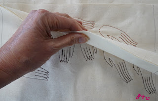
I prepared 8 layers of plain unbleached calico & proceeded to sew in parts of the design on different layers before cutting back.  Here's how it went...


  It may be hard to see, but the hands at the top of the mound are 2 layers of calico, whereas the hands at the bottom are 6 layers thick.  I've also stitched the central begging-for-mercy hands in red thread, with the lowest hands being darker brown & the topmost being lighter brown.

The next step required me stepping out of my comfort zone.

I took my work to my paint table, got the water spray bottle & some paint.  Watch what I did next...


 This is the final result.

This week's art project has been more about process than outcome.

It has been disturbing & confronting & effective.

I'm sure we've all been in a position where we have sought help from someone & their refusal has left us scarred & bereft.  I dare say we've all had times when we've been in the opposite role as well.

In these uncertain & scarey times, please choose compassion towards yourself as well as others.  And please...take care of your hands!!!!


Monday 23 March 2020

HATTIES TURTLE (Weekly Art Project #11, 2020)

 What a pleasure it was to walk into my studio yesterday morning & know I was about to transport myself to Egypt! Such a pleasant distraction from all the anxiety & stress flooding our world at the moment.

This week my project is inspired by the next stop along our Egyptian journey.  From Abu Simbel we returned to Luxor & this time we located ourselves on the West Bank of the Nile, so that we had better access to the alluring Valley Of the Kings.

Our first stop was to the incredible Temple of Hatshepsut (Hattie!).  She was an extraordinary Pharaoh who ruled for 20 years and was also a keen traveller.  As a result of her travels through Somalia she developed a major trade exchange between them.


 I was delighted to see that memories of her travels adorned her temple.

This reminded me of my own home, which... as we self isolate ...can be trasformed with a slight change of perspective...into a museum of our travels & experiences!  On our walls are artworks collected on our travels, each one instantly bringing to mind where they were purchased & the experiences we had in that place.

One of my photos of the frieze of Hatties travels is of this rather charming turtle.  I've chosen him as my muse this week, because...as it happens... a few days ago I saw a little film that Greenpeace produced about the current plight of the sea turtles.  This reminded me that even though we're in the grip of this global pandemic and our focus is very much on getting through it, all those other worrying issues like climate change & polluted oceans don't go away.

So this week, I'm being mindful of the sea turtles!


 I did very little drawing for this exercise as I wanted to keep the design simple.  The bulk of my time went into the HOW part of the process.  Flicking through other photos I developed a colour palette from what I'd seen throughout the temple, which included the pale blue & the rich terracotta that remains on the relief of the turtle.

This week I chose to have the outline for the background in a different colour to that of the turtle.  You'll notice that I have left an unstitched space?  This is because I've mapped out where the turtle is going to be placed & I want to cut down & use some of this golden mustard as part of the body of the turtle, so I didn't really want lines stitched through it!

This is an example of the planning ahead I need to do as I start in on a project.


 It's hard to see, but there's a turtle stitched in there!!  Here's how the cutting back went...


And here is the completed 'Hatties Turtle'. I'm delighted with him.
This project gave me a good opportunity to use some of my map fabric.  I love maps!  I have very little map fabric, so I use it sparingly!  It is ideal for a project like this, even if it isn't a map of Egypt or Somalia! It still makes a reference to travel. I hummed & haahed over using the sky fabric as my blue.  There was a temptation to use a more solid colour fabric.  However, the blotchyness of the sky fabric replicates the little slivers & patches of colour left in the original relief carving, so it works for me.  What an enjoyable way to spend my studio time!  I sincerely hope that you are all keeping well & have your own projects to focus on during this period of uncertainty & stress.  Take care!

Monday 16 March 2020

ABU SIMBEL HATHOR (Weekly Art Project #10. 2020)


Wow! What a week!
Like so many people we've had the disappointment of having to cancel our much anticipated upcoming overseas trip. It highlights to me again, just how fortunate I am to be in a position to travel in the first place & how blessed I am to have had traveled before & experienced & seen so much.

All the more pleasure then in sitting down to my weekly art project yesterday & allowing myself to recall our trip to Abu Simbel located at the very bottom of Egypt.

Our first sight of this impressive temple complex was out the airplane window! With two nights accommodation close by we had ample time to enjoy the impressive Light & Sound Show & explore the Temples.

This week's inspiration comes from a relief inside Nefertari's Temple which is dedicated to Hathor.


We were not allowed to take photos inside, so I made use of my little A5 sketch book & drew my favourite aspects as quickly as I could in low light.  THANKFULLY I labelled where I drew them! This drawing of Hathor in cow form on a barge surrounded by lotus is my favourite & immediately comes to mind when I think of that trip.


Although I knew I wanted to base this week's project on that drawing, I also wanted to be open to other options, so I flicked through my sketch book & redrew some of those quick sketches, all the time thinking..." How am I going to do this??".

After coming up with a plan & drawing up my design, I then contemplated colour.  I didn't want to replicate the tones-of-stone look, which would have been the accurate representation of what I'd seen, so I chose to use my imagination & infuse some colour into the scene.


This sort of project is perfect for using up colour play samples, which is exactly what I chose to use for my first set of outlines. Those stitched lines give only a glimpse to what the finished design will look like.  Here's how the cutting back went...


This was as far as my initial planning got me. It's okay. It's a sweet outcome. But it lacked a lot of interest & oomph.

Thankfully I had kept my cutting-back scraps, so I retrieved them & added a few more lotuses & some lines of stitch & reached a result that I was more happy with.


This is it.
It is amazing how colour, removing a few components and  adding a few other components can transform a design. This looks & feels like quite a different image to that of my drawing, yet they are also so very close to each other.  This was a fun exercise & a delightful trip...albeit via memory...back to Abu Simbel.

Monday 9 March 2020

SUNSET SAIL (Weekly Art Project #9 2020)

 Christmas Day 2011 was like no other Christmas I have ever had!
In the morning we crossed Lake Nasser in a rickety boat to the island of Philae, where we wandered in awe around  the Temple Of Isis.

Then in the late afternoon we sat on the Hotel promenade to partake of High Tea as we watched the sun set. It sounds much more romantic than it actually was.  There was a bitterly cold wind & the tea consisted of a couple of bags floating around in a pot of highly chlorinated tepid water. Still, the sunset was amazing and definitely worth braving the breeze!!

However, if I were asked to condense that day into only one of the hundreds of photos I took capturing those experiences, it would have to be this next one.


 There was something about that patched & repaired sail that filled my heart with delight...it's clearly a textile thing!! It reminded me of Boro & I appreciated the beauty in this weather worn piece of practical fabric.  This is one of my favourite photos from the whole trip to be honest! Is it any wonder then that I chose it as this week's art project muse?!


 If I had been allowed a second photo to remember the day by it would be this. 
This pillar is in the Temple complex on Philae & the gauges are made by the fingers of those who came to Isis for healing.

Would I be able to include a reference to this in my design as well this week? I held that thought loosely in my mind as I began looking at how I was going to start the design making process.


 Using a viewfinder, I started by moving it around the photo in search of interesting compositions.  With different weight pencils I added tonal values & then stood back to see which one I liked best.
  I made my decision, accepting the fact that I couldn't really see how I was going to include the finger gauges in the design.  It was time to move on & choose my fabrics, chanting the mantra 'less is more' as I did so!


 However, in my fabric stash I came across this fabric, the colour of which reminded me of the sunset & the pattern reminded me of finger gauges!! It was definitely going into the mix.

It was then time to iron, layer up, stitch the pattern in & start cutting back.  Here is how it went...


 At this point I was quite happy with how it all looked, but I felt that it needed a spark of interest , so I went back to the photos of Isis Temple & did some quick drawings of the capital decorations atop the pillars.  Perhaps one of these could be included?


As you can see I made a few more additions to lift it into a more interesting outcome.

It is rather different from my usual work, but I have truly enjoyed the whole process, especially the drawing .
The strip patchwork background replicates the seams down the sail & I like the balance of colours & tones.  I'm also pleased with the embroidered capital design.
If I were to do this again, I'd reduce the horizontal lines (which represent the Nile) to 1/8 of the length as opposed to it's current 1/4.  I realise that anyone looking at this (without having read my blog!) wouldn't have the foggiest idea what inspired it, but the important thing is...I do & I'm happy with it.

Monday 2 March 2020

OLD CATARACT CHRISTMAS (Weekly art project #8, 2020; inspired by Egypt)

Egypt is a Muslim country and we were expecting that Christmas wouldn't be celebrated there.  This didn't concern us as, quite frankly, it being our first Christmas without our children we would have rather ignored Christmas altogether ourselves! 

However, it soon became clear that  The Old Cataract Hotel was making a beautiful decorating effort to make it's more Christmas-oriented guests feel at home.  Large red strips & multi sized baubles decorated the tree at the Hotel's entrance & throughout the lobby. It was quite spectacular.

Last week's art project was inspired by exhibits in the Nubian Museum which we visited nearby the Hotel on Christmas eve.  This week's project is based around what we saw next.

When we walked back to the Hotel in the dark, we discovered that the tree above had been transformed.... 


....into this!

It is this magical experience I want to remember with my weekly  art practice, but how am I going to do it!!!!!!


It was clear that any drawing needed to be done in RED! I began by identifying a few groupings of baubles & strips, enjoying them forming small compositions.  The problem with the baubles & strips was that they were rather plain.  That wouldn't be such an issue if the scale I used was small, but what if I wanted to use fewer & bigger baubles, how was I going to create meaningful pattern & texture references? 

I returned to my photos from the Nubian museum, where I came across one of stone blocks from a church archway.  I think it was a Coptic Christian church, but am not absolutely sure.  Anyway, in carved relief on each block was a beautiful decorative pattern, so I chose to use a variation of these to make my baubles more interesting.

It was time to get on with the making & cutting back!  Here's how it went...


This is the final outcome & I'm not very happy with it!
Sometimes bright ideas just don't work! Today was one of those days.

Although the composition looked good with just pen lines on white paper, it looks odd in the final full blown colour version.  Part of the problem is that row of red strips at the back all in a straight line.  They are too close together & would look more interesting at varying lengths.

As for the baubles, I REALLY don't like the blobs of pale yellow & wish I'd just kept the designs in two tones of orange as per the 2nd cutback photo.  Less would definitely have been more in this case.

In the background, I wanted to reference the tree somehow.  My initial plan was to use some old curtain samples, but the ones most appropriate weren't large enough for the background space.  My solution was to use a lino print I had from a printing session last year.  The graphic style of the branches suited the bold shapes in the foreground, & I didn't mind the white.  Of course it wasn't big enough for the whole area either, so I found the blue to match & fill in the gaps. It wouldn't look quite so strong if those red strips broke that solidity up more.

A painter I follow on social media posted something today about the stress of not getting an artwork 'right' & how sometimes, even though you've had a clear idea in your head, and you've tried & you've tried again... it just doesn't work & the only thing to do is ditch it & start over. 

If this were more than an exercise I'd do just that! However, it will remain with all my other weekly art exercises & remind me that disappointments are all part of the process! 
I hope that your art making this week is more satisfying !