
After a couple of weeks holiday, a week of lockdown in Darwin & a return to quarantine in Adelaide, I sat down to resume my weekly art practice on Monday, thankful that my usual routine had finally restored!
But not for long!
In the course of that day I was significantly distracted by news of the arrival of the Delta Covid strain to Adelaide & consequently the rapid role towards another lockdown.
Allowing oneself to be distracted can be either positive or negative to one's mental health. Turning my focus to the Alhambra & the incredible beauty & craftmanship within it's walls was to send a definite positive surge of endorphins to my brain. I'm so incredibly grateful to have been there & to have those memories...and photos to return to, both for personal pleasure and for inspiration.
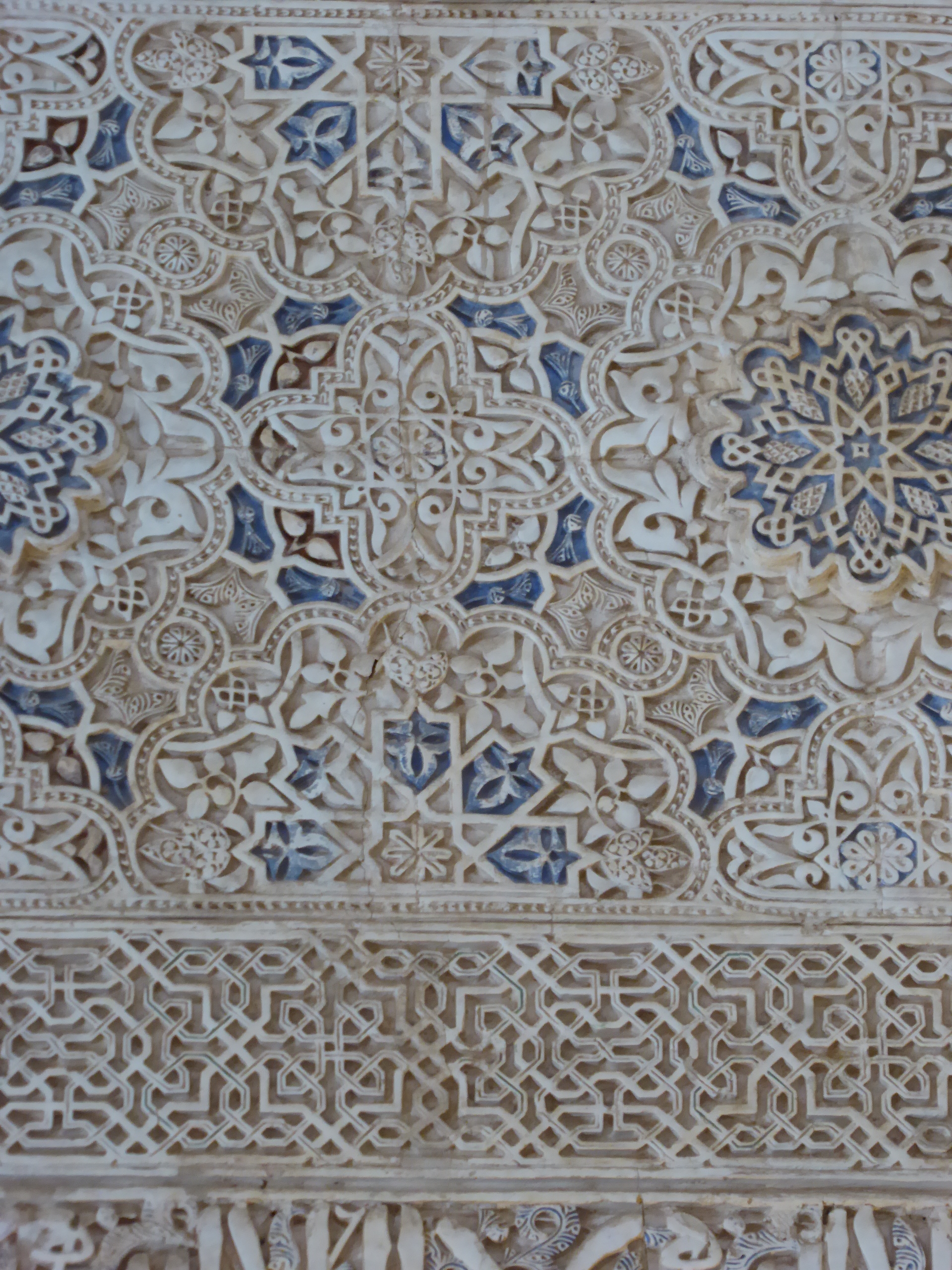
This week it was to the colour blue that I gravitated. Throughout the Arab world blue is a colour symbolising protection. Some sections of the intricately carved plasterwork had remnants of the colour that would have once decorated it. In this particular section though the blue looked as if it was there to stay & the word 'remnant' would never apply to it!

Instead of creating a new design, I returned to the one I prepared for my last weekly art project & highlighted a few more lines. There is no harm in repurposing!


My colour palette was to be blue & white, but for the outlines I wanted a darker beige. Instead of reaching for the calico, I instead cut a section of my earth stained fabric. This is an old sheet that I buried under leaf litter, bark, soil & tree stumps for a month. The resulting staining is intriguingly mottled, which works very well for my textile work.
I used a calico coloured thread to sew the design in & admired how it looked before cutting back the layers.


What is hard to see in these photos is that there are 5 different white fabrics here! One of them is plain all the rest have a white pattern on them.
I have further embellished this piece with blue & white textas.
Over all I'm very happy with how this has turned out & am especially pleased with the top layer that forms the beige outlines. If I had been working this up for exhibition or sale, I would have used beads instead of blue texta dots & embroidery instead of white texta lines. I think this is one of the benefits of samples & exercises like this, the opportunity to see potential options for improving the outcome.
A very enjoyable distraction. I'm already looking forward to seeing what next week's art project inspires me to create!