Tuesday 20 April 2021

PLASTERWORK PATCHWORK (Weekly Art Project #14; inspired by The Alhambra)


 Walking into the Nasrid Palaces of the Alhambra is an overwhelming experience. The walls are lined with intricately carved plasterwork, there are jewel coloured tiles, elaborate wooden ceilings, arches, porticoes & exquisteness everywhere one looks!

Therefore knowing where to start in regards to a weekly art project focus was almost as difficult. I am a keen list writer, so I resorted to this tool as a means of organising some options, and from that list, I made a decision.

This week I was going to focus purely on plasterwork.


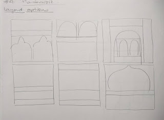
My initial plan was to divide my 20cm square into sections and create a different pattern in each section, just like so many of the Palace walls. With this in mind, I flicked through my photos drawing diagrams of the different composition layouts. During this process, a voice inside my head kept reminding me that a 20cm square is not a very big space to execute a variety of patterns!!

It also occurred to me that the artisans who carved these incredible plasterwork panels, were also skilled in composing the placement of the panels alongside one another. Although intricate they all cohabited so well together, mixing linear with lacey, more open work alongside very close detailed carving etc.

As I recorded the compositions I'd captured on camera, I was enjoying the way the diagrams looked & wondered whether I could use the layouts themselves as my design and use patterned fabrics to represent the plasterwork.  It was worth trying.


It was also a good opportunity to use up some fabric scraps!  I tipped my tub of beige scraps onto the work table & started working through the possibilities, identifying different tonal & colour groups within that whole 'beige' category! 

I decided that instead of arranging the squares into an overall composition at the start, I would produce each diagram as an individual composition and then arrange them at the end.


And so it began, first the choosing and layering of fabrics, then sewing in the design before cutting away to the layers below.  Here's how it went...


I had completed 9 x 6cm squares, each of then unique.  It was time to arrange and rearrange...yes...and rearrange again! I'm sure I could have kept on in that manner, but I had to make a decision at some point!


This was what I settled on & I was very pleased with how it looked.  I could have left it there, but I chose to add more definition to the individuality of each patch...because it really was a patchwork of plasterwork!


This was the final result.

To be honest I'm torn as to which version I like best. I think I prefer the pre-additional-lines version, but I would have had to think of another way of tidying up the edges of the squares! In that version I like the way the individual pieces interact with one another & if I'd had more time I would have liked to have added some hand stitch or beading, which may have contributed to more cohesiveness.

 I don't mind my final result, as it does highlight the individual sections and is definitely much neater. Overall I'm happy with the outcome, either way, and am glad that I allowed myself to explore the 'what if' question.  I'm also grateful that in the process of this project I've discovered another facet of the craftmanship of that Palace to be in awe of.



Monday 12 April 2021

QUEUING (Weekly Art Project #13; inspired by The Alhambra)


At last it had finally come, our timed entrance into the incredible Nasrid Palaces, the moment I had been waiting for for so long........and clearly hundreds of others had too.

There were a LOT of us queued up for our 1pm entrance!  

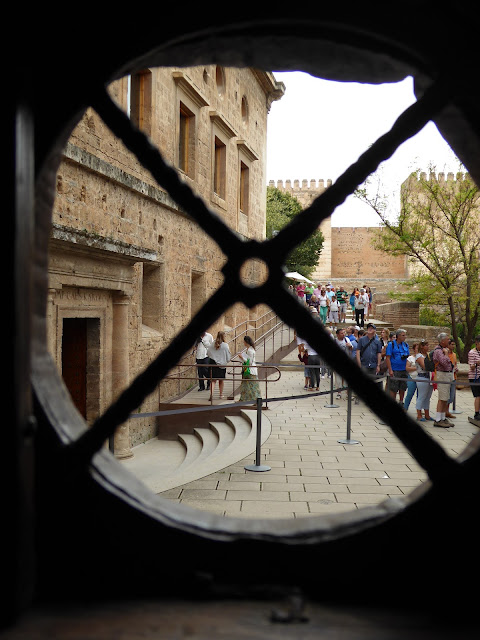
As with most queues it snaked over steps and around corners & moved very very slowly. The above photo is taken from the inside looking out at the tail end of our queue.  I didn't have time to line the camera up properly, but I'm so glad I snapped it, because it does capture the essence of part of the whole experience. Anticipation. Being there but not quite IN there yet!!

It was this photo that I wanted to base today's weekly art project on.  Could I get a sense of the enormous numbers of people who come to visit this place?


 I also still have my ticket.  Could I incorporate it, or reference it in some way?

The drawing book came out & I drew what I saw & allowed my mind to play with a few different ideas. Eventually I reined those ideas into what MIGHT work in a 20cm square!


I made a decision that I needed to make a human shaped stencil.  Out came the knife & an old index page from a folder. I planned to use both positive & negative shapes, so I cut carefully. In the background of this photo you can see a couple of other tools I wouldn't be without!

A plan was drawn up, fabrics were chosen & it was time to sit at the sewing machine.


  There were going to be two 'outlines' , so the first one I stitched into place was the lower level one. I wouldn't cut it back yet though.

I then carefully lined up my upper outline fabric, complete with lines drawn on to guide where the sewing machine needle was to go.


During the process of sewing, I decided to vary the colour of my cotton, just to make it more interesting.

It was now time to start cutting back.

Here's how it went...


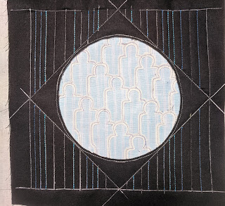
There was a lot of fiddly cutting in this project & to be honest, I think there was too much. If I'd kept the inner circle of repeated bodies to just 3 fabrics, I don't think the fact that they are body shapes would have been quite so lost.

The varying width stripes that frame the inner circle are taken from the bar code of my ticket.  I like the varying thicknesses & the appearance of some of the coloured fabrics.  However, I am very disappointed with the messiness of the lines.  This is because the black fabric was too loose a weave for such closely stitched lines.  This is a very important lesson for me to keep in mind. For the scissors to cut a less hacked looking line, they actually need enough room to get in there to cut!

You may be wondering about my rather odd choice of fabrics.  The coloured ones are all repurposed from well worn shirts.  The colour choices reflect some of the tile colours illustrated on the ticket & being shirts, they also reference people.

Although I'd make a couple of changes to this outcome were I to do it again, I'm still very happy with it as it achieved what I wanted it to. It is most definitely not a disaster & I am very happy with how the design process went. All in all a very good day of exercising my contemporary reverse applique skills!