Monday 24 May 2021

OLD PAINT FRAGMENTS ON WOOD (Weekly Art Project #17; inspired by The Alhambra)


In the Nasrid Palaces of the Alhambra it isn't just the plaster work & tiles that are decorative, the wood work is too.

Wooden doors, ceilings, windows & wall panels are carved or constructed in decorative ways. One would think that this continuum of pattern would clash & cause visual distress, but it doesn't.  It all sits harmoniously together creating an overwhelming sense of beauty & awe from the fact that human hands have created all this exquisiteness!

 When approaching today's weekly art project, I knew I wanted to focus on wood, but didn't know which aspect of woodwork would be my muse. Flicking through my photos with coffee in hand, I came upon the above shot of carved wood showing remnants of paint. At one time this carved panel would have been brilliant with painted colour.  To my eye, it's faded remnants are possibly more appealing than it may have been in it's original full brilliance!!
 

I began with composing a pattern, using my ever useful tools; pencil, ruler & eraser!


For what I had in mind, I was only going to have two layers of fabric for this piece, but being anxious that this may make the outcome boring, I decided to use scraps to create the lower layer.  Using a sheet of applifix I fused them to the backing calico, wondering if I'd already made a foolish decision, but deciding to just go with it anyway!

For the stitching I used a variegated thread,which is something I often like to do as it makes the stitching lines more interesting.


Before cutting back, I wanted to add a paint layer.  In this case I used a stencil with minimal paint, as I didn't want it to seep through to the lower layer beneath.  Yes, I could have painted the top layer first & then stitched the design through, but if I'd done that the stitching would have been on top of the paint.  Doing it this way, the paint was on top & broke up the visual line of stitching.


I'd randomly placed my stencil, & was very pleased with placement & colour choices.  With such exact & symetrical geometric designs it was perhaps a bit against the grain to be so random in my placement, but I was happy with it.
I was even happier when I saw the effect once the top layer had been cut away.


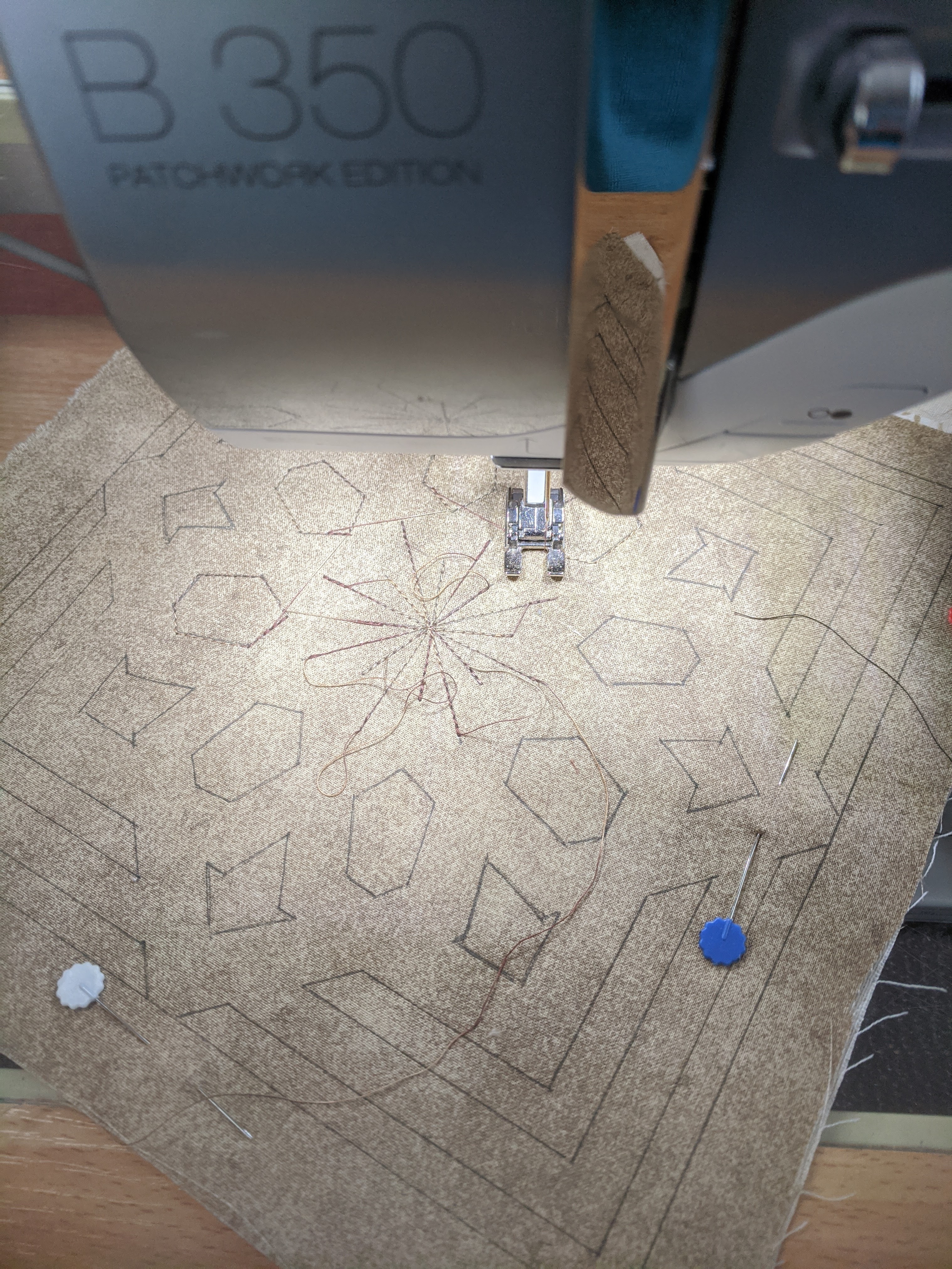
 To complete the piece I used a fabric pen to add in lines to create the effect of outlines going over & under each other.

Whilst not being perfect I am VERY happy with this.  It looks particularly good from a distance & definitely gives the impression of remnants of paint on a woody coloured background!

My only issue is....


 ... I actually like it better upside down! A very pleasing outcome.


Monday 17 May 2021

LANGUAGE AS PATTERN (WAP #16; Inspired by the Alhambra)


In amidst the panels & sections of highly decorative pattern work covering the Nasrid Palace walls, are words. Verses of the Koran have been carved from the plaster in flowing calligraphy to remind people of the principles of their faith.

Because I can't read Arabic, these sections of written language are beautiful to my eye as pattern.  Written language is just that, a series of symbols or patterns attributed to the various sounds we communicate through in our given language.  The combination of those symbols (or patterns) is only meaningful to those who know how to interpret it. To everyone else it is beautiful script (or...pattern!)

With that in mind, I am aware that the experience an Arabic speaker has when wandering through these palace rooms, would be very different from my own, because they would be able to read what is written on the walls!

The Alhambra isn't alone in having quotes on walls.  When I was growing up, we had mainly photos on the walls as opposed to art, but we also had a highly decorated print of  The Lord's Prayer.  In the first bedroom that I can remember a Bible verse hung on the wall & unknown to my parents, I used the back of it to practice writing my name!!


In my own home, the use of the written word as decoration is mainly in the form of fridge magnets, but in the wider community there is quite a market in affirming quotes available in frames & on canvas extolling the virtues of positive thing, gin & cats!! (Among other things!)


With language as meaningful pattern as my inspiration, I began my workday by pulling out my various alphabets in stencil & stamp form.


Before even thinking about fabric & what I might do with these writing tools, I needed to see what they actually looked like; their size, their shape and their ease of use. I was very pleased with this exercise & the variation I had, until I faced the reality that this was an A3 sized paper, and I needed to keep to a 20 cm squared limit!


I pulled out scraps of differing weights of calico & various white cottons, and the process of stamping & stenciling began.  It was disappointing to see that many of my fabric textas need throwing out. At last I had a good sized stash of samples.


After stamping and stenciling I decided I'd also produce a word in contemporary reverse applique!

With all my language samples in front of me I began to mix them around to make a pleasing composition. 


This was the result.

I know it's not very adventurous. To be honest the size limitation meant that a fairly standard linear format would be the  best way to display enough of a variety of sized & shaped words to keep it interesting. I'm happy with it. The day was purely experimental & I enjoyed the process.  It may not look like anything that one would see in the Alhambra, but that's not the point.  The inspiration is most definitely there. This exercise has made me more confident to explore more creative ways of using language in future projects. Good outcome!


Monday 3 May 2021

PATTERN PLAY (Weekly Art Project #15; inspired by the Alhambra.)


April was a month of long weekends, meaning that I only managed to get two of my weekly art projects completed.  I'm hoping to have a less disrupted flow this month. Consequently it was rather exciting to get into my somewhat messy workroom yesterday & just focus on what I was going to create for this first project of May.

One small section of the Alhambra is where the exquisite Nasrid Palaces are & some of the finest Nasrid architecture & decoration in the World. Last time I focused on the lace-like plaster (stucco) work & how panels of differing patterns work so cohesively together.  

The plaster work is also often seen alongside the gem-like azulejos tiles, so this week I am going to play with this effective combination.


It just so happens that I did some shopping at the annual stitch & craft fair last week & bought some stencils that look arabesque! As with any new toy, I wanted to try them out & this seemed like a good opportunity.  

 Out came other stencils & stamps from my collection & after a rummage through the paint pots I began a printing session.

To be honest, it soon became apparent that neither my blues nor my greens were quite right, or more accurately...they didn't work for me!  So I changed my palette to a blue & gold combination.


The most effective prints were made using a gelli plate.  I became so immersed that I completely forgot that I had an appointment (and I'd forgotten to set my phone alarm!) .  Thankfully a phone call interrupted me &  I was able to quickly scrub the paint off my hands before heading out.

It also meant that the pieces I'd printed could dry!

A couple of hours and a flu shot later, this was my selection of dry & ironed fabric options.

Now...what to do with them!


I had intentionally created options in various tonal values & was very pleased with all of my outcomes. Naturally I wanted to use all of them, but that was not going to be feasible within the 20cm square limitation! Quite a LOT of time was spent layering and rearranging!

Eventually I made a decision & got to work sewing them into place, before doing a little bit of cutting back. Here's how it went.


I'm very pleased with the finished outcome. 

The cut back sections representing azulejoes are in satin & so have the same sort of shiny quality that the glazed tiles have.( Azulejoes are small glazed tiles used to create geometric patterns.) I'm very pleased with the colour palette & variation in pattern. I also really like the way the stitching looks in the unprinted lines of the lower panel.

My one frustration is that I couldn't find my A4 sized gelli plate, so none of my prints were 20cm long.  If they had have been, I would have liked the cut back section to extend all the way across the width.  This, however, is the best outcome from what was available to me & I'm happy with it.