Wednesday, 28 March 2018

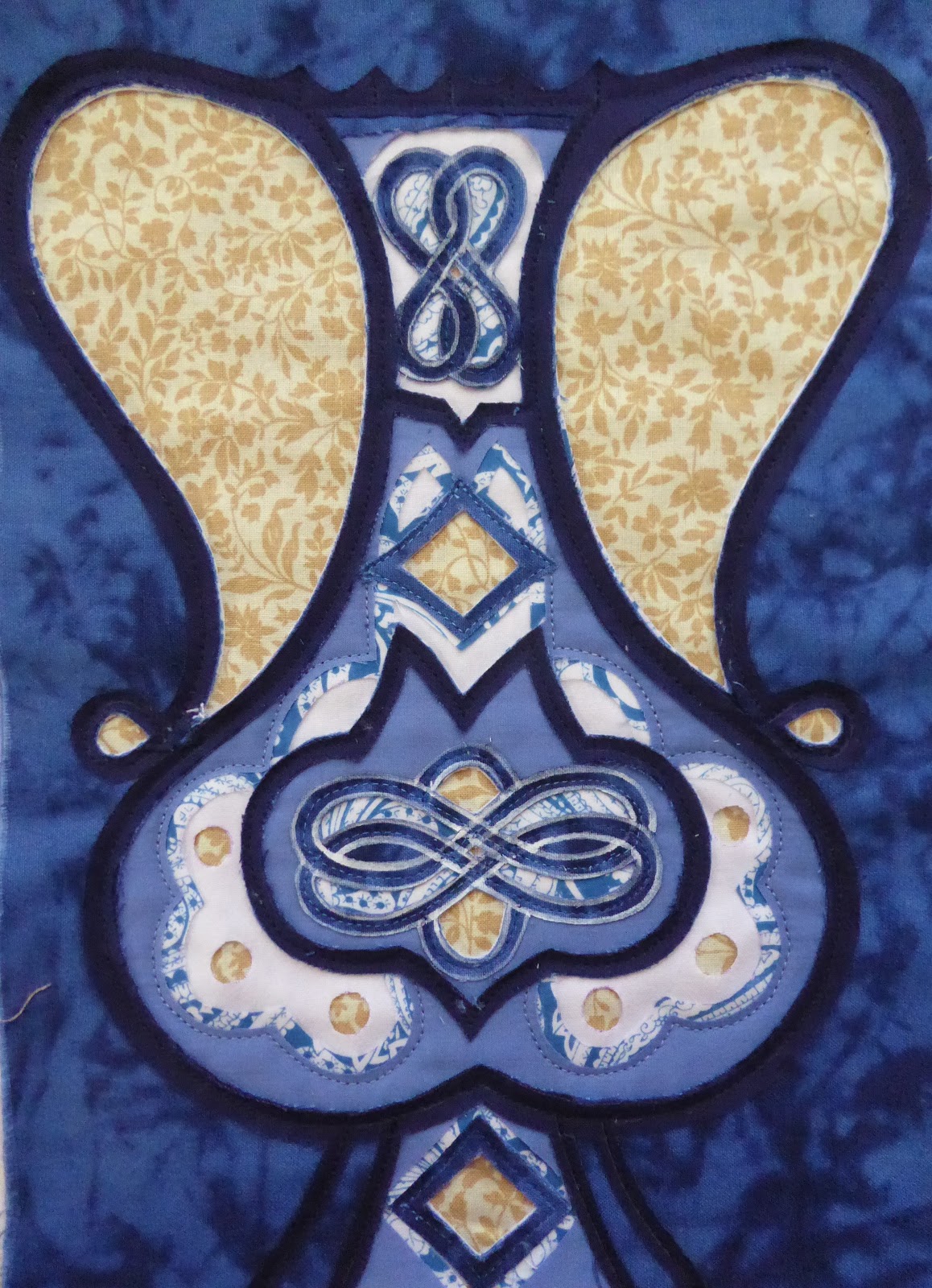
ANOTHER TILE POT (WAP # 10; Istanbul)


Once again, thanks to multiple interruptions & computer crises....  it has taken me all week to complete one tiny little A4 sized weekly art project!

And once again, I have focused on a single pot shape found in amidst the wonderful foliage-oriented tiles that enhance Topkapi Palace in Istanbul.

Using a sketch completed last week, I leapt straight into designing for this week's art exercise.


Folding an A4 piece of printer paper in half length wise, I used my little sketch as a guideline for the shape outline of the pot. After drawing it in with pencil & then going over it with a thick black pen,  I then traced it onto the other side, revealing a beautifully symmetrical pot!


I could have worked out my design for the pot decorations in my workbook... but given the stop-start nature of my week, I chose to play with design ideas directly onto the pot shape itself.  With  frequent use of the eraser & my my circle stencils, I eventually came up with a design that could be worked in contemporary reverse applique.


The choice of fabrics was particularly critical, as I didn't aim for a bold pot this week, I wanted something that looked more intricate .  As luck would have it, I had a piece of curtain fabric in the same pattern as last week's background, but in a different colour combination. This serendipitous find was an excellent starting point for working out my colour range.

Once cut, ironed & the design transferred, it was time to machine sew the outlines in.  Then I was ready for the fun part...time to let the cutting back begin.

Here's how it went...


Before cutting back the second layer, I chose to paint some outlines before cutting away from them.  the reason for this was that I wanted to get the interwoven effect & the cutting alone wouldn't have achieved that.  Once dry, out came the scissors again...


Each stage of this process of cutting back has been fun, because each fabric brought a completely different 'look' to the piece as it was revealed.  By the time I was cutting back to reveal the background, I realised that I had somehow put more fabric layers in than I'd planned!  I'd clearly been contemplating one over another, gone off to deal with the stuff of life, come back & just included both fabrics!

Just as I felt that this bold patterned background didn't really work for last week's exercise, it hasn't worked brilliantly here either.  Having said that, it does give the effect of being part of a bigger intertwining pattern, which fits with the original source of inspiration.

I am very pleased with my pot, all things considered & am grateful for an opportunity where I could just focus on one small, yet important feature of the stunning tiles of Topkapi Palace in Istanbul. 


Wednesday, 21 March 2018

TURKISH TILE PLANT POTS (#9 WAP; Istanbul)

It's been another one of THOSE weeks!

Instead of sitting down on Monday & focusing fully on completing the weekly art project that very day, it was stop-start, stop-start, stop-start all the way.  In fact this project wasn't finished until late Wednesday afternoon!  I like to enter into a flow of focused work & find it very frustrating when life happens in a less than smooth momentum.  That, however, IS life...and even with the frustration I did manage to complete the piece, albeit eventually!!

Topkapi Palace sits on a perfect area of land, with views out over the Marmara Sea on one side, and the Bosphorus on the other. Built in the Ottoman Empire to house the Sultan and his family, this Palace is now the location of an exquisite museum.  One of the features that sent me into a spin, were the stunningly beautiful tiles.  Mostly in the colours of blue, white & turquoise with the occasional splash of red, panels of tiles line walls along  external passageways as well as whole rooms in the interior.  The Harem being home to some of the most beautiful.

My project started with pulling photos out of my Istanbul photo album!  I placed all the ones showing plant pots/vases in front of me for closer examination, before taking up my pen & recording each of their shapes.  These vessels are the point from which wonderful arrangements of fantastical flowers & vegetation spring forth & meander, intertwining gracefully up tiled panels.  The end result is beautiful, but on this occasion, I just wanted to focus on the one component; the vessel itself.

There were a variety of shapes & each was unique.  Once again, the process of sketching revealed details that in a passing glance, are often missed.

With a repertoire of pot shapes before me, I then made a decision about which one I was going to try & develop for my weekly art project.


Once the design was complete...& I must admit it took a while...it was time to make fabric decisions.  The plain colours came very quickly for me, with the biggest decision being to exchange lime green for the red used in the original tiles.  For the background, I rummaged amidst my stash of outdated curtain fabric samples & found one with large interwoven flower designs.  Being close to the colours I'd already chosen, I thought it a good option & a reasonable representative of the background flowers seen in the tiles.


For this piece I was going to use three different colours as 'outlines' for different parts of my design.  This meant that I had to be extremely careful about where I placed them in the sandwich of fabric layers.  First I sewed the lines into the white fabric & this time I tried something new, I chose to use a different coloured thread for one section only.  The black thread looks like a contrast at the moment, but once the next two layers are sewn in place & the cutting back begins, you'll see that the black ties in with the black outlines & makes the piece more cohesive.

The first fabric to be cut back was the black, leaving the black outlines.

The second fabric to be cut back was the green, leaving the green outlines. (You can see that black stitching beginning to work it's cohesive magic now!)

Finally the white fabric was cut back to reveal the majority of outlines.  Do you see how the black stitching of the tulip frieze bridges the visual gap between the upper black outlines & the single one at the base?
Don't the white outlines look dramatic against that blue!  It was very tempting to leave it at this point because it does look spectacular!  However, it wasn't finished yet & I was curious to see how the next lot of cutting back would look.

Although not as dramatic as it was in the previous step, I am very impressed with how well this pot has been cut evenly enough to perch between the two big flowers of the background!

In hindsight, choosing a bold background for a bold foreground shape was a mistake.  A finer print in the background would have had a greater impact.  However, this was all I had & I am content with the result.  I like how the eye travels backwards & forwards between the vessel shaped by the green stripes & that created by the blue fabric.

This was a fun WAP & I'm excited to be able to explore the tiles of the Tokapi Palace in more depth over the upcoming weekly art projects.

Monday, 26 February 2018

UNDERWATER PROTECTION (WAP#8; Istanbul)

One of the fun things to do in the Basilica Cistern,  is to look for the Medusa heads!  There are two of them. Clearly they have been re-purposed from a former Roman era building & have had the important task of holding up pillars in the Cistern.

However....that's rather boring!

It is much more interesting instead to accept one of the myths.... believed to be from a family of Gorgons (& Gorgons being monsters of the underground world), the Medusas were placed in the Cistern to protect the precious waters there.  They are placed upside down so that they won't turn any of us to stone!  People throw coins into the pool that this head sits in, trying to win a little of that luck & protection for themselves.

I know that they are stone, so don't actually have feelings, but I found myself feeling sorry for the Medusas.  Having her head  upside down,  partially immersed in water & covered in green slime is not the most pleasant way to spend eternity!

How was I going  to capture this setting & environment with fabric & stitch....that became the question for my art project this week!


I know, I know....usually I start with paper & pen & some form of drawing.  However, yesterday, I just felt like trying something else!

I already had a sketch I'd done of one of the Medusa heads (currently sitting up the right way in the Archeological Museum Garden) whilst I was in Istanbul.  This could be printed onto fabric & turned upside down...but what else was I going to do with it.  I chose to start ripping a few pages out of a magazine, with the view of 'sketching' with collage.  The colours I chose were greens & blues to represent water.

I happened to just plop the strips I'd cut onto the Medusa head & have to acknowledge...I quite liked it like that!  However, it lacked intent & I so I tried a few variations...

The last one worked for me & I liked the way the sense of water was coming from above & dropping vertically,  as well as sitting in a horizontal position.  Now to attempt this ...or something like it...in fabric!

One of the negative aspects of contemporary reverse applique, is that there are always a lot of scraps!  I keep a large proportion of mine & so it was too the scrap bins that I went to source the fabrics for this project.  I then needed to do a LOT of ironing!!!

For this style of work, I was endeavouring to build up & cut-back layer upon layer, instead of my usual method of having a full stack of fabrics at the start & them working down the whole lot layer by layer!  This style requires a bit of intuition & spontaneity ...not practices I'm very confident in!  At least I had my collage 'sketch' as a visual guide!

The layers were stacked, stitched & cut back, slowly building a sense of the water in this underground cavern & the way  Medusa is separate, yet a part of it.
I got to this stage & felt that it was enough, in terms of layering.  However, the head just wasn't working for me, at least not as well as it had earlier in the paper collage variation.  I could see that the proportions were wrong, I would have been better to have enlarged the head before printing it onto fabric, but there wasn't a lot I could do about that now...what did I need to do to make that head look a little more included in the environment??


Out came the fabric pens & I applied a little colour to her face!!  This works MUCH better!

If I were to do this piece again, I think I would change the proportions to this & I would have some of her head poking out of the 'water'.

Regardless of seeing the need for further improvement, I am happy with this outcome & I enjoyed working on this WAP. It is always good to step out of the usual routine & try something a little different!!


Tuesday, 20 February 2018

REPEATING REPETITION (WAP #7)


Last week I started exploring the features of the Basilica Cistern in Istanbul that made a particular impact on me.  For this week's art project, I've chosen the second of that list; the reflections of the pillared arches.

Golden light seemed to wash beautiful coppery tones over the whole Cistern & the water below reflected that precision and colour so perfectly that at times it was hard to identify what was solid & what was illusion.


I had two photos to work from, and as is my practice, I started with pen & paper mapping out what exactly I was looking at.   Whilst blocking out shapes & lines, I was also asking myself what I wanted to do with this information I was drawing into my work book. What did I want to play with today?

The answer was repetition.

I often use mirror imaging in my architecture inspired art works.  This time however, I wanted to do more than just a couple of mirror images.  Therefore,I decided to divide my A4 space into 9.  This meant I had a rather small size in which to create a design that reflected the pillars & arches of my inspiration.


Once I had worked up a rough idea of what was physically possible within that space, I photographed with my mobile phone & then using one of my nifty little apps....


... I had before me a rough idea of what my design could potentially look like...eventually.

This was an intriguing image, so I set to work cleaning up my design, tracing it onto an A4 sheet of paper, then transferring it to fabric.

First layering, and stitching and then...let the cutting back begin!!


This was the end result & I am very happy with it.

I know that it is a little shabby looking with all those fraying edges & yes, I would have been wise to have snipped them back before taking this photo!  However...the light was fading & I needed the photo immediately!

It was a mammoth cutting task in a day that was interupted with frustrating telephone conversations (with internet provider)s, so...I was quite distracted.  Nevertheless, this piece draws me in.  It alludes to what it could be if it was repeated many times over.  My eye is drawn to the surface then it travels further into the depths, before coming back again.


Because my photo isn't perfectly square, this version through my app is a little distorted, yet it does give an idea...of a slightly pinker version...of what my design might look like.

It does capture the essence of those repetitive reflections in the Basilica Cistern to me. Another weekly art project well worth investing the time in. :-)

Wednesday, 14 February 2018

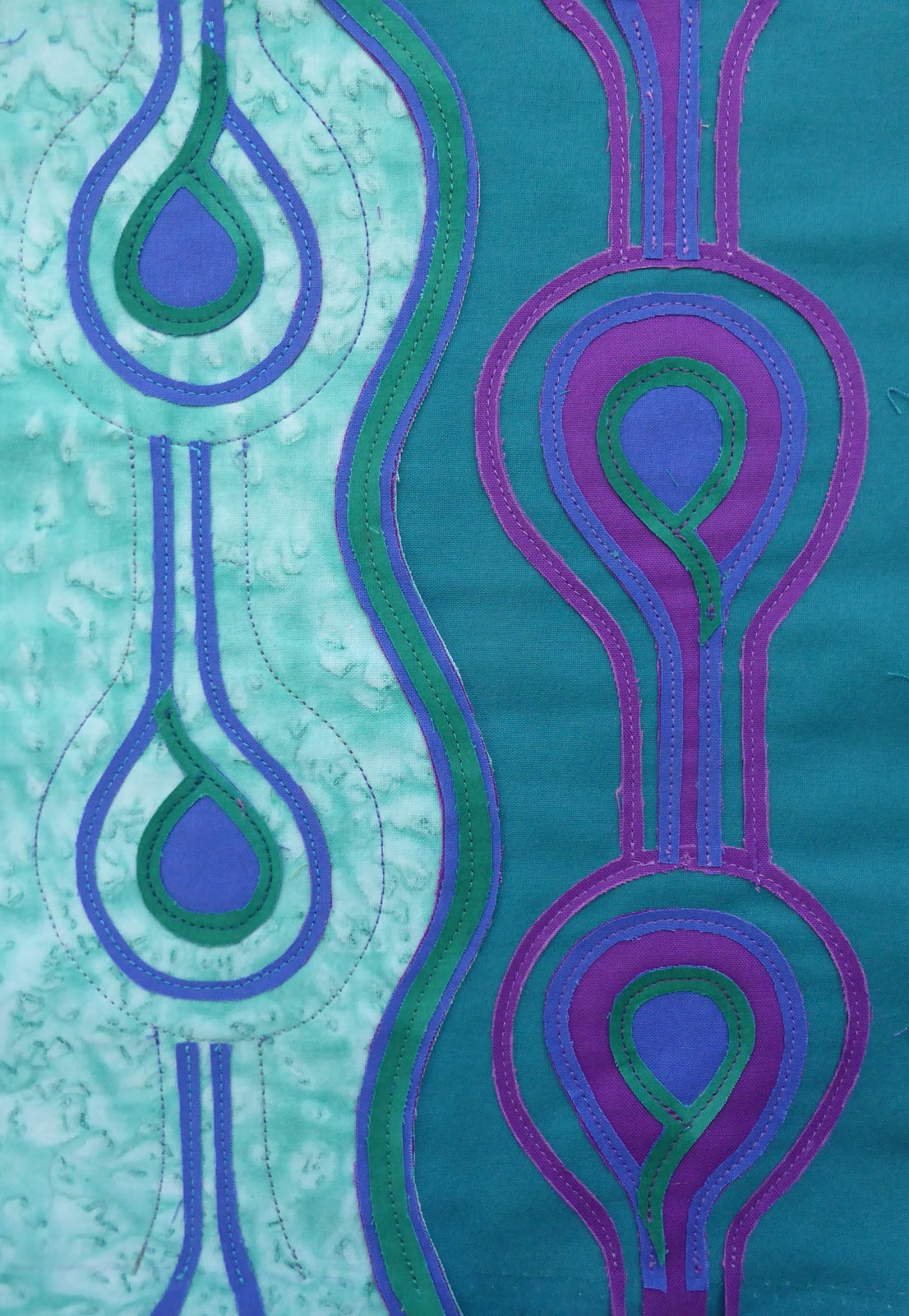
DRIPPING PEACOCK FEATHERS (WAP#6, Istanbul)

My last weekly art project was an exploration of the  brick ceiling of one of the underground cisterns of Istanbul.

This week I have been inspired by another one, this time the Basilica Cistern, which had a starring role in the Tom Hanks film version of Dan Brown's book 'Inferno'. This was the place where a deadly virus was hidden before activation! Scary stuff!

Unlike our first cistern experience where we were the only ones there....THIS cistern attracts the tourist population in DROVES.   Therefore we visited this spectacular Byzantine underground sanctuary alongside hundreds of other people.  Even with so many footsteps clattering along the wooden walkways, the utter beauty of the place was not lost, nor was the fact that this truly is a marvel of engineering.

There were three specific areas of beauty for me & I hope to explore each of those in the coming weeks.  The one I have been engrossed in this week, is the peacock feather column.

Earlier ...above ground, we had wandered around the streets near our hotel &  come across random pieces of antiquity just scattered on the side of the road.  Among them was this fragment of a marble pillar, decorated in a stylised peacock feather pattern.

Peacocks are symbolic symbols in both Christian & Muslim traditions, so it made sense to find the pattern on a column that no doubt graced a Byzantine building.

Imagine how excited we were to then find one UNDERground in amidst numerous plain cylindrical columns.  This time though, water was dripping from it, as if the peacock was crying about the fact that it was wet & slimy &  hidden away in the dark!

Why was it there? Possibly through the practice of plundering...or recycling!  Regardless of the reason, I found the column beautiful &  worth spending some time thinking about in an artistic way!

 I started by drawing what I saw.  Although it involved only fairly simple lines, the act of drawing requires that I look with a more analytical eye, & in turn I made discoveries I hadn't noticed before.

What was I going to do with this pattern?  There wasn't much point just copying it as a fabric representation.  What did I want to say about these columns?  What story did I want to tell? What did I need to do to create a design that respected the original, but told my story?

Art making involves a lot of asking & then answering questions.

I kept my design simple.  On one side I referenced the peacock feather design as I saw it, on the other side I turned them upside down to represent tears of water droplets.

After assembling my fabric choices, I decided I was going to use a variety of threads as well, so I gathered the possibilities.

Then it was time for the cutting back to begin...

Wow!  Get the sunglasses out, that lime green is BRIGHT!
Do you see the watery patterned turquoise fabric that is forming the central background?  That section was supposed to be the pale blue that fills the background of the lefthand side background, however, I had a little brain-warp when I was placing it in the layer & ...ahem...didn't put it all the way across.  Consequently when I cut back to that layer there were half moon shaped patches of the backing fabric showing.  GRRRR!

I remedied it by putting this new fabric BEHIND the backing fabric, stitching it in place, then cutting the backing fabric back to reveal this.  In hindsight it may have looked better to cut away the pale blue altogether & just have the water fabric, but as you can tell...I didn't think of that at the time!!

That bright lime green was really bothering me!  How could I tone it down a little.  I took a photo & using my computer editing programme started drawing on possible quilting lines as a means of softening the impact.  The lines are wiggly because I only have a mouse & not a stylus!  This idea had potential, but the green took the focus away from the peacock feathers.  How about if I...

Oooo, I LIKE that!
What if I adapted both to create more interest...

It is very hard to see in this image, but there are paler green lines coursing their way through that lime green background!


This was the final outcome and I am pleased with it.  It captures the essence of peacock feathers, the green of the underground pillar, and the water dripping like tears because the pillar was not where it was initially designed to be seen and admired!

I could have incorporated this inspiration in with one of the others from the Basilica Cistern, but I'm glad I haven't.  It has been a good exercise to not over complicate the design by putting too much information & intent into it.  Although this design couldn't be considered a stand alone 'real-piece-of-art' design, it certainly has potential as a border or feature in a bigger piece.  A worthwhile effort.