Thursday, 4 January 2018

FIRST SITE (Weekly Art Project '18; Istanbul #1)

 'It's a dangerous business going out your door.  You step onto the road and if you don't keep your feet, there's no telling where you might be swept off to."  JRR Tolkien

 
It was May 2011 & I was FINALLY in Istanbul, a place I'd had on my wish list for absolutely ages. I was almost paralytic with excitement!  Two whole weeks in this ancient, magical city was such a gift, an opportunity...AND I had my first digital camera!  The city was literally at our Hotel doorstep but where to start? Dodging touts trying to sell us souvenirs, postcards and guidebooks, and armed only with a map and a sense of anticipation, we ventured forth.

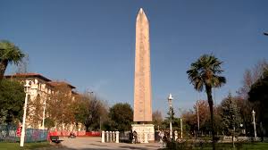
The pedestrianized area that in Constantine's day was known as the Hippodrome, stood before us and shooting skyward from it's centre, was an obelisk that looked somewhat out of place.  Carved from pink granite, the obelisk of Thutmose lll had once graced the Temple of Karnak in Luxor, Egypt, before Emperor Theodosius had other plans for it! 


I'd just been reading "Theodora" by Stella Duffy & she mentioned the owl on the obelisk.  It was the first thing I noticed & has consequently stayed with me over the years.

Therefore, on resuming my weekly art practice,  it was inevitable that it be my muse.  This year's theme for the WAP (weekly art project) is travel and, as you may have guessed, my first  destination was Istanbul! Whilst I have been looking forward to starting it, as with any discipline that requires regular practice, getting back into the routine after a break took a concerted effort!

Out came paper & pens.  I approached the blank page with a specific idea in mind, but soon after starting to make visual notes, my ideas changed.  You'll notice that I also made written notes of my thoughts as I drew .  This process is very helpful in developing an idea & helping it take the next leap towards a design.

My colour palette was compiled after I'd decided what my design would be & how I was going to produce it.  You'll notice they're grey!  Although the obelisk in question is made of PINK granite, & you can see why in the photo at the start of this blog,  that photo has been used from stock available on the internet & was clearly taken on a bright sunny day. The close up of the owl section of the obelisk is mine.  We were there on an overcast grey day...therefore, everything was grey!

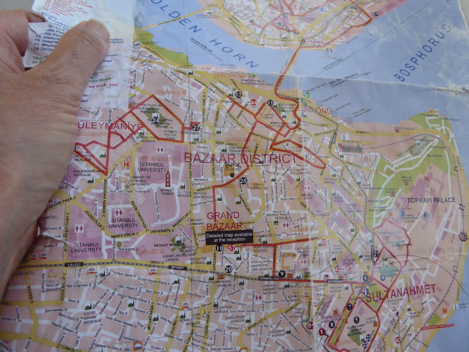
In my 'travel memorabilia' stash, I'd come across the map of Istanbul we'd been given at the hotel.  Creased & written on, and with some sections so worn as to be undecipherable, I decided to print it onto fabric to create the background for my first Istanbul piece.

All my layers were put in order before I sat at the machine to stitch the design through the whole lot.  Then it was time to let the cutting back begin!

There was a brief halt, as I stitched the second outline in place.  I LOVE using variegated thread when I want the stitched line to be obvious,  it adds interest & movement to a piece.  For this second outline, I chose a variegated thread that had a grey to brown colour range.  It looked as effective as I had hoped it would!  Time to get the scissors ready again & cut back some more!


I was so excited to see it all come together.  Unusually for me, I then chose beading as my next step, as opposed to embroidery.

One of the observations that I'd made in my initial visual note taking process, was that the eye is a symbol of protection in Turkey.  The blue eye amulet is on everything from shopping bags to doorways.  Wanting to reference that connection & knowing that I still had a blue eye bead in my stash, I stitched it onto the egyptian eye, before tackling the owl eyes.  The beads I had for the owl were small & round, whereas the eyes of the obelisk owl were more almond shaped, like human eyes. Using small pieces of fabric, I added them along with the beads.

I knew that I wanted to add some stitch to the owl's body, but it wasn't until that big  amulet bead was in place that I thought about mirroring those blue tones with thread.  The results are charming!

I am delighted with this first little piece.  It cements in my mind, that first walk onto the Hippodrome, that glance up to see the owl  & think of Theodora in the same place so many years before doing the very same thing!

More recently, the Obelisk of Thutmose lll has been the scene of tragedy & terror, when a group of tourists were the victims of  a homicide bomber.  Sorrow & joy so often walk hand in hand.  This   piece will force me to remember them, as well as my own wonderful memories.


* Please note that the first photo of this blog is a stock photo uploaded from Google.  The rest of the photos are my own.  Please respect my copyright of them.
If you enjoy travel blogs then you can read more about our adventures in Istanbul at istanbuljoy.blogspot.com.au 


Monday, 18 December 2017

WEEKLY ART PROJECT #7; HEAVY HEADED LAVENDER


We have a variety of lavender bushes growing in the gardens around our house.  They grow well, are great for the bees & smell wonderful whenever we brush past them!  The one that grows at the edge of our front porch has an amusing characteristic that the other bushes don't share.  It droops it's developing flower head, as if it is just too heavy for the adjoining stem!

Set against a backdrop of large leafed succulents, tree foliage and a water tank, I thought this made an interesting composition possibility for #7 of my weekly art project.

I began with drawing with black pen, a little colour variation in green & purple in a series of rough 4cm square thumbnail sketches.  I recorded what I saw...and then played with those components.

Eventually I had a design I liked!  Now...how to transfer this idea into fabric!

The fabric stash held some very exciting possibilities.  And so the sewing & cutting back began.

More cutting back & even more soon brought me to the realisation that I had somehow, accidently turned the background around the wrong way.  Oops.

Once it was all cutback, I was able to see what else it might need, as embellishment, to give it a lift.  It was clear that the purple I had used for the lavender head was too close in tone to the grey in the background, so I added some stitch.

That did the trick!  I was very pleased with my end result & I loved the colour combo!!  Using two different shades of green for the stems also adds energy & interest.  Only I would know about the mix up with the background & it still looks okay anyway. Phew!


Sunday, 17 December 2017

WEEKLYART PROJECT #6; ROSE BUD CALYX

In one of our gardens we have a David Austin rose, which is deep red and has a true 'old fashioned' rose scent.  Sadly, the local possums like to eat it's beautiful buds, so I try & pick them before they become food.  Their calyxes are like a dancer's arms, so graceful & elegant.

Using two thicknesses of copic pens, I began by drawing line sketches.  Using flat colour, I highlighted the difference between the rose bud and the calyx.

It was the beautiful calyx lines that I fell in love with, so I traced each one, cut them separately, and had a little play with grouping & overlapping the lines.

It took a LONG time for me to find a combination that I was content with! 
Roses in  hand, I then rummaged through the fabric stash, auditioning fabrics alongside each other, finding the right combinations.

After working out which fabric would sit in which layer within my 'sandwich' of fabrics, I transferred the design and started sewing in the stitching lines.  In the process of getting my supplies for this little project together, I discovered that I was seriously short on red sewing thread! (Out came the shopping list!!)  In the end, I chose a variegated green thread, which shows up against the fabric, so I had to be careful my stitching was smooth!!

Then the cutting back began.  This is always like Christmas to me!  So much fun!  The first few cuts boded well!

A considerable amount of cutting back later & this is the final result.
Whilst I quite like the flowing nature of the lines, the background is perhaps a bit too busy & distracting.  There is something not 'right' with this piece.

Recreating it into greyscale, via the magic of computer photo tools, I can see that the tonal values of the focal shapes are too similar to those of the background.  They blend in rather than draw the audience's attention to them.

Perhaps if I had added some sort of shadow to break up that sameness,...as I've tried to illustrate above with my very poor computer mouse drawing skills,  it may have been a more successful composition.
This is the value of exercises...to learn!


Friday, 1 December 2017

WEEKLY ART PROJECT #5; POND IRIS


Our pond is home to four fish,  waterlillies that never flower, a pump that doesn't work,  lots of strappy plants and...currently...a beautiful water Iris.  This flower only appears when it wants to, so it is an extra special treat when that happens.

Although this means that two WAPs (weekly art projects) in a row have been inspired by an Iris, I don't think that's a problem! :-)

I took a few photos of this elegant beauty hiding amidst the straps of green before heading to my work books to start looking closer & exploring further.


This week I abandoned my black pens for sketching, and used only greens and purples to make visual notes and explore creative ways of interpreting the flower & the environment in which it sat.  It is good to change methods from time to time, it keeps the process fresh, interesting & it can inspire completely different ideas & options.

As you can see I ventured into the realm of abstraction, which was a lot of fun & I liked where it was heading.


Once set on a design, I gathered my fabrics together & began by preparing a background with the white.  I use an air erasable pen, which appears as purple, and eventually completely disappears.  This helps me see where I'm going.

To create the flower, I carefully cut vliesofix backed fabrics to the various shapes of my flower design & iron-appliqued them together.

It was then time to carefully place the Iris between the background & the foreground fabrics, before I could begin sewing those foreground lines in to secure them all together.


I held my breath during that first cut back.  Had I placed the Iris in the right spot? Yes, I had!!


Before anymore cutting, I gave the Iris some machine embroidered features, which also served to secure it in place more reliably.  Then it was time for the cutting back to begin.


This is the final result, and I'm very happy with it.
Definitely a fun & pleasing exercise!!

Wednesday, 29 November 2017

WEEKLY ART PROJECT #4; IRIS


Planted around our house are several clusters of purple Iris.  They seem to have a mind of their own as to when they want to flower.  This makes it all the more exciting on discovering that a bud has formed.  I love the shapes the buds get into before they unfurl into petals, much like delicate butterfly wings.


I cut a single Iris & took it indoors to study further with pen & pencil.


These were the pleasing results.
Having completed a more realistic drawing of both a bud & the flower, I chose to do a quick linear drawing of the flower in black pen.  It was from this that I saw the potential to develop a design for my weekly art project.


Using my trusty view finder, I moved it around the sketch, looking for interesting combinations of line and form.

These I made a visual note of, and then developed one design further.  It is amazing what changing the thickness of a few lines will do!


After the usual routine of gathering fabrics, sewing in the design and then cutting back, this is what I had produced . 
I absolutely love those dramatic lines.
However, it was a bit dull...it needed more oomph!  I also wanted to reference the colour more obviously.


I achieved that by creating more lines!
Stitched lines in purple thread form the narrow vertical lines, whilst the horizontal ones were achieved by cutting back to another fabric below.

Whilst I would make a couple of changes if I were to do this again, I am quite pleased with the result.  I am also pleased with the background fabric, which ties the colours together well.  In some of the purple stripes, I have put hand stitching, which may be lost in the photo above, but does add a textural quality to the piece...even if only noticeable under close scrutiny!!

I am actually beginning to enjoy this weekly art project...dare I admit, that I look forward to it each week????

Tuesday, 28 November 2017

WEEKLY ART PROJECT #3; PEACH BLOSSOM

 The first peach blossom to appear is always an exciting discovery.  It's pale pink petals look so delicate & fragile against the solidity of the wood branches.  The leaves are also delicate when they first emerge in their fresh lime green newness.

This year  they appeared just as grey & miserable weather was about to hit Adelaide.  The pink stood out beautifully against the grey sky as well as the grey corrugated roof of the neighbour's house.

Using  photos as a reference, I began by making a few sketches, exploring both line & colour.

Once settled upon a design, a rummage through the fabric stash eventuated in these choices & I was very happy with how the colours sang together.

Before starting on the fun...flowery...part, I needed to create a corrugated roof like background with my grey fabric.

The process continued with sewing the design through the layers & then cutting back...and cutting back...and cutting back some more!

This was the result after all that cutting, but it wasn't quite complete yet.

The addition of embroidery & beads finished it off nicely.

I love the flow of the purple lines, the colour choices and in particular, that green silk.  It is one of those fabrics that I wish I'd bought a million metres of, because it has proved to be so perfect for so many different projects.  Sadly, there's not a lot left now! Sigh!  Such is life.

Because of the square format I felt as if I had to squish the design up a bit to fit.  Of course, it wasn't until afterwards that I realised I could have rotated it & placed the blossom across the diagonal!!!!

This is an exercise.  I am always learning!!


Monday, 27 November 2017

WEEKLY ART PROJECT #2; ARUM LILY

We have had horrendous weather this past week (Oct 3, 2016) & expecting more rain yesterday, I nipped out & cut a bunch of  Arum lilies before they were battered any further.

My elegant Arums usually appear around spring time & I look forward with delight at seeing their flowing lines and graceful forms!  We have several clumps of them dotted around the garden, each flowering at different stages.  I love them from bud until full flower!

Naturally, I was inspired to use them as my muse for the weekly art project.

Being so attracted to their free flowing lines, I wanted my sketches to be quick & catch some of that freedom.  Several of these had potential, but I eventually chose one to take further...into colour!

It might be hard to believe, but this is how I spent a few hours!!!!  Design development takes time!


After committing to a design, and rummaging through my fabric stash, I then sat at the machine to sew in the design & then begin the process of cutting back!!

Followed by more cutting back...

And even more cutting back!

Whilst there was something deliciously appealing about the simplicity of the previous step in producing this piece, I felt it needed something more to draw the eye, so the yellow beads were added. 
I'm very happy with the lily, the shape & flow of lines & the beads, but am not so happy with the movement of lines in the left hand side of the background.  They distract & take focus away from the lily itself.  If I were to do this again, I think I would make them more like the right hand side & maybe use different greens...or at least ones that are a bit more interesting!!