Monday 9 August 2021

LEON THE LION (Weekly Art Project #21; inspired by the Alhambra)


It was somewhat of a shock to realise that this, being week #21, is my last weekly art project focused on the Alhambra. It seems to have gone by very quickly even with all the interruptions along the way.

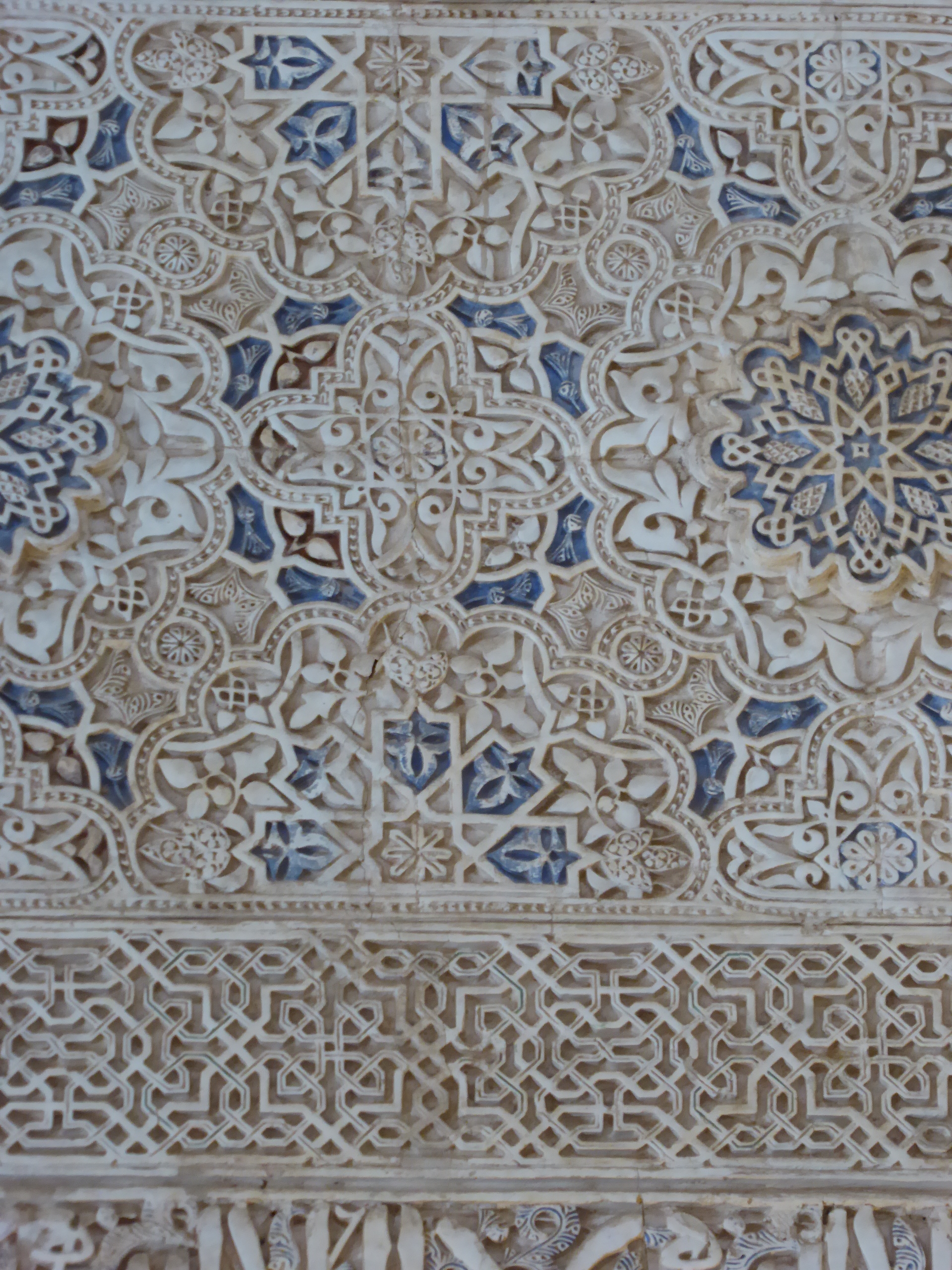
My goal was to seek inspiration from what I saw & what moved me within the space of one day in one place. Of course, I could have used every art project to reproduce a piece of that wonderfully patterned plasterwork, but I wanted to respond to inspiration sources with a creation of my own, not just a copy. All in all I have created quite a varied range of responses in textile & they certainly do transport me back to that stunningly beautiful place.

What then to choose for this last project? 

Well it had to be Patio de los Leones, also known as the Courtyard of the Lions. This courtyard is in the centre of the Nasrid Palaces & it's centrepiece is the marble bowl of a fountain seemingly held on the backs of 12 lions. 

They are charming, but to be honest, they have never really looked like lions to me.  More like cats or dogs! The sculptor has given them wonderful texture on their bodies & if we were allowed to get close enough I can guarantee that few visitors would resist being able to stroke their hands over that carved 'fur'.

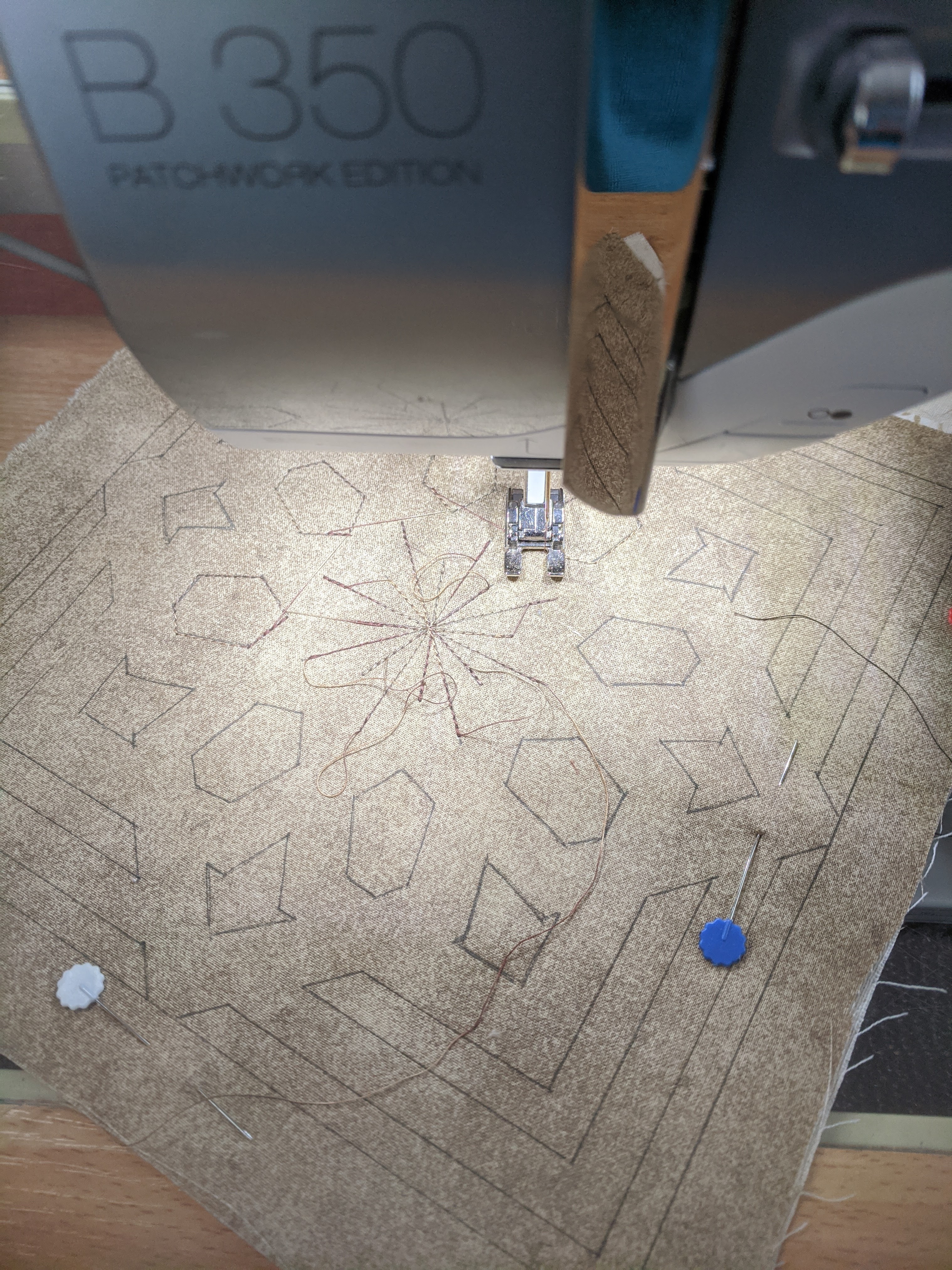
Some very quick drawings helped me feel my way around the shapes of their faces & to recognise two different ways that fur/hair was carved.  I wanted to give a lion some sort of mane. It didn't take long to realise that that might not be easy in a 20cm square, but I could at least try!

Here's how the cutting back went...


I'd slipped in a scrap of printed fabric from an earlier project as my background.  It gave a little bit of colour variation as well as contrasting the curved lines with straight angular ones. I was pleased with how my lion was looking, but wanted to un-cross his eyes & give a little more definition, so this is what I did...


All in all I'm quite pleased with the outcome, even if it may have been more impressive in a wider sized space. Leon the Lion still doesn't really look like a lion to me, more a striped cat with a lion spirit! 

It has been fun to do & I think he was a lovely inspiration for my last project.

Next week, I'll endeavour to compile each of my 21 projects into a book format, to sit alongside my Egypt & Istanbul ones.  I had initially thought that I'd follow this series of art projects up with one inspired by Morocco, however I've changed my mind.  I'll take a break from Islamic influences & instead refer to my photos from a trip to Iceland! There is a LOT of inspiration to be found there!

Thank you for accompanying me each week via this blog & for the encouraging comments along the way. I hope that I've encouraged you to revisit your own holiday snaps & have a go at exploring them through art making.


Monday 2 August 2021

STAINED (Weekly Art Project #20, inspired by the Alhambra)


The past few weeks in Adelaide have been discombobulating & consequently it has been hard for me to return to my WAP (Weekly Art Project) rythmn.

 I'd attempted to start on a project last week inspired by the stained glass window above.  The simplicity of design, luminosity of  colour & contrast to the plasterwork are worthy of exploring. I got part way through & just couldn't maintain focus, so instead of  pushing myself that little bit further, I changed what I was working on.  There are definitely times to push through an energy hiccup & times when changing the activity is the wiser thing to do. 

This week however, I was in a much better frame of mind & was keen to return to my usual practice. Besides, I had a new toy I wanted to play with.


A very generous friend had just given me these beautiful Caran D'Ache water soluble crayons and I was desperate to try them out. 

Could I use them in a design that represented the stained glass?  

Why not?!


I started with a trial sample just to see how they'd flow on fabric. They are so smooth & were a delight to use. I liked the way they highlighted the weave of the cotton. Quite by chance some cotton thread got caught under one section & effectively created a raised surface for a rubbing.  I liked that added texture it provided so thought I might include that in my WAP project.


I then got the paintbrush & water out & applied to the crayon...oh my...yes indeed! What fun & possibilities. My head was bursting with the potential these could have in my textile work.

It was time to move from sample to art project, so I began by drawing freehand the design I've used before.  I made a bit of a whoopsie & consequently over did the black crayon to hide it!  Oh well....I'd do something with it later. Here's how it progressed...


I had placed loose coils of cotton thread under the blue sections & managed a 'rubbing' effect there. In the centre I thought I'd try my Caran D'Ache water RESISTANT crayon with the water soluble one layered over it.
Three different greens are layered here & I really like the way they look.
Time to add the water, & I'm very pleased with how the middle resist has worked out, I also like the subtlety of the 'painted' design in the green sections.

Stitch is added to that heavy black outline in the centre to give it a bit more interest & soften the impact.

At this stage, I'm very conscious that this project is proving to be more about exploring a product than about responding to the stained glass of the Alhambra.  

Was I happy to leave it at this point?  I could argue that the textural elements related to the intense textural qualities of the plaster work, but I recognise that that is wrangling words to justify what I've been doing, rather than respecting my initial intent.

What to do then, to hint at that luminous, bright coloured glass?


I added more water to the blues, added some red & added a bit more colour to the centre. To me these changes definitely recall stained glass, whilst still retaining a textural quality.

The subject of 'finishing' artwork has been on my mind lately.  A comment in a novel about unfinished artwork being more intriguing than fully resolved work raises an important question - when is an artwork finished? When have we done enough?  We could also ask ourselves what we mean by 'finished' & is it the same as 'complete'? 

You'll notice that I didn't 'colour in' the linear sections in the design above in yellow.  I alluded to it with quick yellow lines as my attempt to try not finishing 'properly'!  It wasn't easy to leave those lines, but I actually think the piece is more interesting because of that in-completion. The focus is on the coloured spaces rather than the lines.

It will be interesting to see how these musings impact my future art making. Until next time...happy creating!


Tuesday 20 July 2021

BLUE AND WHITE (#19 Weekly Art Project; Inspired By the Alhambra)


After a couple of weeks holiday, a week of lockdown in Darwin & a return to quarantine in Adelaide, I sat down to resume my weekly art practice on Monday, thankful that my usual routine had finally restored!  

But not for long!

In the course of that day  I was significantly distracted by news of the arrival of the Delta Covid strain  to Adelaide & consequently the rapid role towards another lockdown.

Allowing oneself to be distracted can be either positive or negative to one's mental health. Turning my focus to the Alhambra & the incredible beauty & craftmanship within it's walls was to send a definite positive surge of endorphins to my brain.  I'm so incredibly grateful to have been there & to have those memories...and photos to return to, both for personal pleasure and for inspiration.

This week it was to the colour blue that I gravitated. Throughout the Arab world blue is a colour symbolising protection.  Some sections of the intricately carved plasterwork had remnants of the colour that would have once decorated it. In this particular section though the blue looked as if it was there to stay & the word 'remnant' would never apply to it!


Instead of creating a new design, I returned to the one I prepared for my last weekly art project & highlighted a few more lines.  There is no harm in repurposing!


My colour palette was to be blue & white, but for the outlines I wanted a darker beige. Instead of reaching for the calico, I instead cut a section of my earth stained fabric.  This is an old sheet that I buried under leaf litter, bark, soil & tree stumps for a month.  The resulting staining is intriguingly mottled, which works very well for my textile work.

I used a calico coloured thread to sew the design in & admired how it looked before cutting back the layers.


What is hard to see in these photos is that there are 5 different white fabrics here! One of them is plain all the rest have a white pattern on them.

I have further embellished this piece with blue & white textas.

Over all I'm very happy with how this has turned out & am especially pleased with the top layer that forms the beige outlines. If I had been working this up for exhibition or sale, I would have used beads instead of blue texta dots & embroidery instead of white texta lines.  I think this is one of the benefits of samples & exercises like this, the opportunity to see potential options for improving the outcome.  

A very enjoyable distraction.  I'm already looking forward to seeing what next week's art project inspires me to create!


Monday 7 June 2021

BOTANICAL CEILING (#18 Weekly Art Project inspired by; The Alhambra.)


I'm very conscious of how much more we get out of our travel experiences these days (when we can travel!) with the availability of a digital camera and a decent zoom lens. I would not have been able to instantly appreciate the decorative work in the ceiling shown  above if it were not for the art of zooming in.

High above our heads incredible ceilings floated, drawing our eyes heavenward & straining our necks.  These were equally as detailed in decoration & skill as the walls that surrounded us as we wafted, dream-like through the Nasrid Palaces of the Alhambra. 

This ceiling was particularly interesting as it held within it's geometric lines & shapes botanical images.  I couldn't tell whether they were painted or brass inlays, but they were impressive especially when the light caught them. 

My curiosity was captured, so I decided to make this ceiling my muse for today's art project.


I began by just looking. Observing. Analyzing what I'd captured on camera.

It didn't take long to decide on a geometric pattern as the base of today's experiment. It did take quite a while however to measure & draw it all up.  First on paper, then on my topmost fabric with a pen that could be easily erased with the heat of an iron. 

One of the aspects I wanted to capture was the double black lines in the centre of the wood sections. I planned to make these my stitching lines.

Stitching in those lines took concentration & a certain amount of frustration.  It is one thing to draw it all accurately, it is quite another to stitch those precise lines into fabric that will stretch or move. The length of my stitches didn't always comply with the length of my line either. Oh well!


At last the stitched lines that held my layers of fabric together & provided guidance for the outline were complete. I took a moment to appreciate the effectiveness of that double line & my perfectly coloured fabric choice before getting out the scissors!  It was time to cut back.  

Here's how it went...


I reached this stage & was very happy with the outcome.  Now it was time to leave the sewing table & tackle the 'botanical' part of this piece.  A storm was brewing, so I'd timed it beautifully to nip out to the garden & gather a few leaves for what I had in mind before the rain came.

It soon became clear that only the very small leaves would fit onto my charcoal gray spaces, so I worked out an arrangement that pleased me, then took it all over to my printing table. The plan was that I'd print directly from the leaves & blossom onto my work.  Out came the rollers & gold paint.


In hindsight I think I would have been better to roll paint onto a gelli plate and apply the leaves to that in order to get better paint coverage . But I didn't do that. I was in a hurry & rolled paint directly onto the leaves, which was extremely fiddly given how small they were!!

Once applied, a layer of baking paper provided a little protection from the roller, which I put all my weight into as I pressed those leaves into releasing that paint.


This is the final result & I'm very happy with it.

What doesn't show up in this image is the gold of the paint. In real life it doesn't look as yellow as this photo.  I used Jo Sonya's Rich Gold, so it has a bit of depth & captures the light really well. 

Although the prints are not perfect, they work well enough for me. This not only brings back a memory, but provides me with another way I can combine techniques effectively.  There is also something special about combining something of home (my garden) with such memories of such a special place.

This has been a fun experiment & I'm happy with the outcome. There will be a few weeks before my next project as I'm heading off on holiday soon. Woohoo...more inspiration!!


Monday 24 May 2021

OLD PAINT FRAGMENTS ON WOOD (Weekly Art Project #17; inspired by The Alhambra)


In the Nasrid Palaces of the Alhambra it isn't just the plaster work & tiles that are decorative, the wood work is too.

Wooden doors, ceilings, windows & wall panels are carved or constructed in decorative ways. One would think that this continuum of pattern would clash & cause visual distress, but it doesn't.  It all sits harmoniously together creating an overwhelming sense of beauty & awe from the fact that human hands have created all this exquisiteness!

 When approaching today's weekly art project, I knew I wanted to focus on wood, but didn't know which aspect of woodwork would be my muse. Flicking through my photos with coffee in hand, I came upon the above shot of carved wood showing remnants of paint. At one time this carved panel would have been brilliant with painted colour.  To my eye, it's faded remnants are possibly more appealing than it may have been in it's original full brilliance!!
 

I began with composing a pattern, using my ever useful tools; pencil, ruler & eraser!


For what I had in mind, I was only going to have two layers of fabric for this piece, but being anxious that this may make the outcome boring, I decided to use scraps to create the lower layer.  Using a sheet of applifix I fused them to the backing calico, wondering if I'd already made a foolish decision, but deciding to just go with it anyway!

For the stitching I used a variegated thread,which is something I often like to do as it makes the stitching lines more interesting.


Before cutting back, I wanted to add a paint layer.  In this case I used a stencil with minimal paint, as I didn't want it to seep through to the lower layer beneath.  Yes, I could have painted the top layer first & then stitched the design through, but if I'd done that the stitching would have been on top of the paint.  Doing it this way, the paint was on top & broke up the visual line of stitching.


I'd randomly placed my stencil, & was very pleased with placement & colour choices.  With such exact & symetrical geometric designs it was perhaps a bit against the grain to be so random in my placement, but I was happy with it.
I was even happier when I saw the effect once the top layer had been cut away.


 To complete the piece I used a fabric pen to add in lines to create the effect of outlines going over & under each other.

Whilst not being perfect I am VERY happy with this.  It looks particularly good from a distance & definitely gives the impression of remnants of paint on a woody coloured background!

My only issue is....


 ... I actually like it better upside down! A very pleasing outcome.