Wednesday 28 March 2018

ANOTHER TILE POT (WAP # 10; Istanbul)


Once again, thanks to multiple interruptions & computer crises....  it has taken me all week to complete one tiny little A4 sized weekly art project!

And once again, I have focused on a single pot shape found in amidst the wonderful foliage-oriented tiles that enhance Topkapi Palace in Istanbul.

Using a sketch completed last week, I leapt straight into designing for this week's art exercise.


Folding an A4 piece of printer paper in half length wise, I used my little sketch as a guideline for the shape outline of the pot. After drawing it in with pencil & then going over it with a thick black pen,  I then traced it onto the other side, revealing a beautifully symmetrical pot!


I could have worked out my design for the pot decorations in my workbook... but given the stop-start nature of my week, I chose to play with design ideas directly onto the pot shape itself.  With  frequent use of the eraser & my my circle stencils, I eventually came up with a design that could be worked in contemporary reverse applique.


The choice of fabrics was particularly critical, as I didn't aim for a bold pot this week, I wanted something that looked more intricate .  As luck would have it, I had a piece of curtain fabric in the same pattern as last week's background, but in a different colour combination. This serendipitous find was an excellent starting point for working out my colour range.

Once cut, ironed & the design transferred, it was time to machine sew the outlines in.  Then I was ready for the fun part...time to let the cutting back begin.

Here's how it went...


Before cutting back the second layer, I chose to paint some outlines before cutting away from them.  the reason for this was that I wanted to get the interwoven effect & the cutting alone wouldn't have achieved that.  Once dry, out came the scissors again...


Each stage of this process of cutting back has been fun, because each fabric brought a completely different 'look' to the piece as it was revealed.  By the time I was cutting back to reveal the background, I realised that I had somehow put more fabric layers in than I'd planned!  I'd clearly been contemplating one over another, gone off to deal with the stuff of life, come back & just included both fabrics!

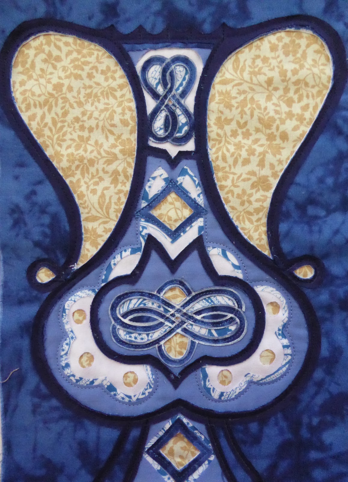
Just as I felt that this bold patterned background didn't really work for last week's exercise, it hasn't worked brilliantly here either.  Having said that, it does give the effect of being part of a bigger intertwining pattern, which fits with the original source of inspiration.

I am very pleased with my pot, all things considered & am grateful for an opportunity where I could just focus on one small, yet important feature of the stunning tiles of Topkapi Palace in Istanbul. 


Wednesday 21 March 2018

TURKISH TILE PLANT POTS (#9 WAP; Istanbul)

It's been another one of THOSE weeks!

Instead of sitting down on Monday & focusing fully on completing the weekly art project that very day, it was stop-start, stop-start, stop-start all the way.  In fact this project wasn't finished until late Wednesday afternoon!  I like to enter into a flow of focused work & find it very frustrating when life happens in a less than smooth momentum.  That, however, IS life...and even with the frustration I did manage to complete the piece, albeit eventually!!

Topkapi Palace sits on a perfect area of land, with views out over the Marmara Sea on one side, and the Bosphorus on the other. Built in the Ottoman Empire to house the Sultan and his family, this Palace is now the location of an exquisite museum.  One of the features that sent me into a spin, were the stunningly beautiful tiles.  Mostly in the colours of blue, white & turquoise with the occasional splash of red, panels of tiles line walls along  external passageways as well as whole rooms in the interior.  The Harem being home to some of the most beautiful.

My project started with pulling photos out of my Istanbul photo album!  I placed all the ones showing plant pots/vases in front of me for closer examination, before taking up my pen & recording each of their shapes.  These vessels are the point from which wonderful arrangements of fantastical flowers & vegetation spring forth & meander, intertwining gracefully up tiled panels.  The end result is beautiful, but on this occasion, I just wanted to focus on the one component; the vessel itself.

There were a variety of shapes & each was unique.  Once again, the process of sketching revealed details that in a passing glance, are often missed.

With a repertoire of pot shapes before me, I then made a decision about which one I was going to try & develop for my weekly art project.


Once the design was complete...& I must admit it took a while...it was time to make fabric decisions.  The plain colours came very quickly for me, with the biggest decision being to exchange lime green for the red used in the original tiles.  For the background, I rummaged amidst my stash of outdated curtain fabric samples & found one with large interwoven flower designs.  Being close to the colours I'd already chosen, I thought it a good option & a reasonable representative of the background flowers seen in the tiles.


For this piece I was going to use three different colours as 'outlines' for different parts of my design.  This meant that I had to be extremely careful about where I placed them in the sandwich of fabric layers.  First I sewed the lines into the white fabric & this time I tried something new, I chose to use a different coloured thread for one section only.  The black thread looks like a contrast at the moment, but once the next two layers are sewn in place & the cutting back begins, you'll see that the black ties in with the black outlines & makes the piece more cohesive.

The first fabric to be cut back was the black, leaving the black outlines.

The second fabric to be cut back was the green, leaving the green outlines. (You can see that black stitching beginning to work it's cohesive magic now!)

Finally the white fabric was cut back to reveal the majority of outlines.  Do you see how the black stitching of the tulip frieze bridges the visual gap between the upper black outlines & the single one at the base?
Don't the white outlines look dramatic against that blue!  It was very tempting to leave it at this point because it does look spectacular!  However, it wasn't finished yet & I was curious to see how the next lot of cutting back would look.

Although not as dramatic as it was in the previous step, I am very impressed with how well this pot has been cut evenly enough to perch between the two big flowers of the background!

In hindsight, choosing a bold background for a bold foreground shape was a mistake.  A finer print in the background would have had a greater impact.  However, this was all I had & I am content with the result.  I like how the eye travels backwards & forwards between the vessel shaped by the green stripes & that created by the blue fabric.

This was a fun WAP & I'm excited to be able to explore the tiles of the Tokapi Palace in more depth over the upcoming weekly art projects.