Tuesday 30 January 2018

TULIP TEA UNDER CISTERN CEILING. (WAP #5; Istanbul)


 Not all the treasures of Istanbul are above ground. 
Some of the awe inspiring structures that the Byzantines left behind, are the cisterns below the city; great cavernous spaces for the storage of water.  The Basilica Cistern is the best known one & is consequently a major tourist attraction. It has also featured in a few big budget movies, but our first Cistern experience was in the quieter 'Cistern Of 1001 Columns'.

In fact, we were the only ones there!


 This is what I said about it in my travel blog at the time;

"...we came upon the Cistern of 1001 columns & were the only ones there, except for the guys running the cafe.  We sat down with another Turkish tea , lapped up the tranquility& listened to classical music bounce off these ancients columns...along with the drips! It was  a treat."

'Treat' was an understatement!!
The soft golden red light, the narrow bricked ceiling, the music, the drips & drinking Turkish mint tea in tulip shaped glasses. To think that this incredible space had been there since the 4th century! It was quite magical & so... naturally... I wanted to focus on this experience for my art project this week.


 However, focus wasn't in great supply! 
The weather had been particularly hot & I hadn't been sleeping well.  Because my workroom is not air conditioned, I'd had to do my working out in the living area.  Being a creature of habit, this new location made me a bit unsettled & fractious & grumpy &....well, I'm sure you can imagine.  

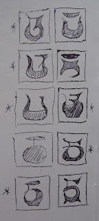
I've shown you this spread from my sketch book (above) to encourage those of you who don't always produce nice, neat, cohesive preliminary drawings ! 
On this particular day, this scrabble of scribbles was all I could muster, but it was enough to proceed with.
 

 Instead of my fabric stash, I went to one of my many scrap bins for pieces that I could use to remind me of that fabulous brickwork. 
In the sorting & deciding process, I was looking for a lighter colour & I remembered that I had some tea dyed fabric left over from a series of art pieces I completed a few years ago.  This was perfect, it was not only the right colour, but it imbued this piece with reference to the tea drinking part of the whole experience.

 My design could have been presented in two rows of three, however, I decide to make it a little more interesting by creating three rows of three in the format above.  I worked out my layers & cut them each to the size of the space they were about to dwell in. 

There were to be two different outline fabrics.  For consistancy, I chose to keep the second layer all  the same fabric.  It was a faded pinky cotton that had designs scattered across it that were reminescent of the designs found on  Turkish tiles.  I do like there to be connection in the componants of my work, even if I'm the only one aware of their symbolism & relationship.  It was this  layer that I needed to sew the outlines on first.


 After that, the top layers were carefully sewn on.

It was then time for the cutting back to begin!


Although I would have liked to have got more of a curve into the edges above, this was the best I could do within this size of the design, without compromising the effectiveness of the 'bricks'.

To this I now wanted to add a frame to the centre, because I'd come up with something I felt quite excited about putting in the middle! Out came needle & thread.


As I mentioned earlier, part of the exquisite experience was the slow sipping of tea under the brick domed ceiling of this ancient cistern. Although my tea dyed fabric made the perfect lighter sections  ceilings, I also wanted to refer to the tulip shaped tea glasses that we sipped from.


Therefore, I started playing with the shape of the glassware, trying to transform it into my very own tulip-teacup  caligraphy. 


Choosing my favourites & a fine paint brush, I squeezed a dollop of gold paint onto my palette & carefully added these little treasure symbols.

This is the end result & I am so happy with it.  It does bring back a sense of the experience & atmosphere in that Cistern setting.  I love it...can't stop staring at it! What a great way to end a project, after starting it feeling so very frazzled.

Thursday 25 January 2018

FABULOUS FOLIAGE. (WAP # 4; Istanbul)

Once upon a time, very near where the Blue Mosque stands today, there was a magnificent Grand Palace.  At that time Istanbul was known as Constantinople & being a meeting point for international trade,  was very wealthy.  It was also very beautiful, and a fitting place to build a Grand Palace that would be considered a wonder of the world.  For 690 years it was home to the Emperors of Constantinople. Now, there is very little left to see, but the remains of some truly exquisite mosaics that make up the contents of the Mosaic Museum. 

I remember feeling quite overwhelmed by the artistry in the construction of these mosaics.  There were a number showing wild animals, set in interesting compositions with fabulous use of colour. My favourite mosaics though were of trees & plants, with wonderful shaped leaves & numerous bands of colour.


As my own photos were dark & not very clear, I was very grateful to have had the foresight to purchase a book about the Museum. It, thankfully, did contain good photos, so it was from these that I sourced inspiration for my art project  this week.

This was such a good opportunity to experiment with using contemporary reverse applique to create a mosaic effect.  Not something I had done before...but I was genuinely excited to give it a go!

I started with simple lines sketches of a few foliage possibilities.  The one I wanted to take further, received a splash of paint to guide me in my colour choices.

This was my colour palette & as an unusual feature, I was using the same fabric for my topmost outline layer AS WELL AS for my background colour.  Hmmmm....this was going to be interesting!  With a backing fabric layer as well, that is 10 layers of fabric my machine was going to have to stitch through!!

Once I had machine sewn the design through them all, I referred to my plan as to what colours I needed to cut back to at which point.

It was time to let the cutting back begin....


I was so pleased with how it was looking up until this point.  I was particularly pleased with the snippets of other colours I kept in some of the 'tesserae' .  It's a bit hard to see in the photos above, so here's a close up...


Now I'd reached the dangerous part.  I had noticed that time & centuries of being walked over, not to mention being buried under ground for another few centuries, meant that the grout around the paler tesserae appeared quite dark, whereas it was quite light around the coloured  tiles.  Therefore, I was hoping to achieve this effect by using my darkest colour layer to create the grout lines for the background tiles.  I held my breath & went for it!


This is A4 in size & I have to tell you, it involved a LOT of intricate cutting.  My thumb was well & truly blistering after this scissor-happy experiment.

This outcome is intriguing.  It reminds me of cellular structures!  The dark blue outlines do tend to significantly detract from the coloured section of the 'mosaic' & in hindsight, I definitely went a bit too dark with my fabric choice.  However, it's not a complete disaster & there are ways of changing that overpowering impact.


I whipped out the white paint & made a wash to painstakingly paint over all the outlines.  It is a vast improvement.

However, with a little photo manipulation on my computer, THIS is what I would have preferred it look like!  Regardless, it has been a fun experiment, which I will certainly be more open to trying again...once my thumb isn't feeling quite so tender!!

Wednesday 17 January 2018

KEEPING AWAY THE COBWEBS. (Weekly Art Project; Istanbul #3.)


 The Blue Mosque is so named because of the number of blue Iznik tiles that grace the walls of it's interior.  My distinct memory, is of being somewhat disappointed that there weren't MORE blue tiles!!  I did think that the Mosque was exquisite, but when led to believe one thing, only to find that the reality isn't QUITE what was imagined...that can be a bit of a let down!

So, in this Mosque, it isn't the tiles that I have remembered, it's the Ostrich egg!  A few of Istanbul's Mosques include ostrich eggs amidst their light fixtures as they are believed to deter spiders & consequently...cobwebs!  It must have worked, because I didn't see any evidence of spidery activity whilst I was there!

The other part of the Mosque that I distinctly remember, is the courtyard, with it's simple plastered domes. it's stripey bricks & the elegant pattern work painted in a single colour.  The medallions & lace-like patterns managed to be both intricate and simple & I thought they were beautiful.


 Looking at my photographs, I've also been disappointed to discover that the few taken of the tiles, that are actually in focus, are rather dark.  Nevertheless,  I use these to make some simple linear sketch 'notes' in my work book. 

Whilst doing this, I'm still thinking about the ostrich egg & the courtyard motifs.
How can I bring all of these components together to create something unique & new?

Whilst I am trying to create a design, there are other things going on in my household.  I have interruptions & frustrations & feel utterly discombobbled!  I do wonder whether I should just leave the WAP for the day & do it again when I can focus more.  My disciplinary self admonishes me with a reminder that I've made this commitment & MONDAY is the day I set aside to complete it, so it HAS to be done then!!  I sigh & plod on until I reach the point where I've got the bones of an idea, but not the fine points.

As you can see from the multiple line changes above...I just couldn't make up my mind!  It was time to just  start & hopefully something would click & it would all fall neatly into place once I got going!

I chose my fabrics, which thankfully required a minimal number!!.


 First of all I wanted to prepare my background.  This cute fabric has been in my stash for at least 20 years.  I have no idea what it was originally purchased for, but it is perfect for this project.  With a white background & repeated intertwining flowers & vines, it is reminiscent of the wall tiles of the Mosque's interior.  I divided the space with lines of machine sewn stitch to represent the wires from which the chandeliers hang.  Perhaps it would be better to sew more lines, but I stick with the initial 4.
 After layering up & cutting back, this was my result.

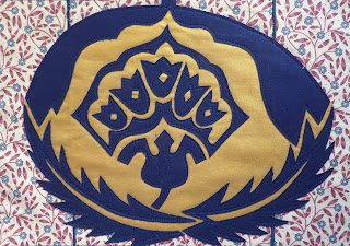
I had wanted to showcase the egg & my plan had been to decorate it with my variation of a tile flower design & some of the decorative patterning.

Whilst this isn't a COMPLETE disaster, it doesn't really say 'Turkish Mosque'.  Instead it looks like an easter egg decorated with a Scottish thistle in the style of a logo for a country club! 
Not quite what I had hoped for. 
I did like the effectiveness of the plain blue & the brilliant gold though, so that was one positive!


 I slept on it & awoke the next morning with less distractions & went down to my work room to start work on other art works.

However, the Easter Egg just kept staring at me & I knew that I couldn't leave my weekly project there.  Even if it did mean that I was about to break one of my self imposed rules.  At the end of the day, I want these projects to represent my memories & experiences, & what I had achieved the day before wasn't doing that for me.

I started asking myself the question...what if I turned it around?  Out came the paints & pen & I quickly whipped up a new interpretation from the preliminary drawings the day before.  This looked more promising.  I had just enough of that background fabric, so I set to work again.

My final result is this.

And ...yes...the first thing my daughter asked was whether it was a football!
But I know it's an egg & I'm relieved that the flower is no longer Scottish looking!!  Whilst it is still not a perfect outcome, it is much improved on the initial attempt.  These projects aren't about perfection, they are about exploring possibilities & stretching my concept & design skills!

In hindsight, I might have been better to have stopped on Monday, when I was finding it so hard to focus.  I respect my 'disciplinary' self, & I recognise that the reason I was being so strict, is that if I didn't give myself time boundaries  I'd be chipping away at it all week, when I have other commitments that need that time. 
Having said that...perhaps I could allow myself to be a wee bit more flexible! ;-)

Monday 8 January 2018

A BLUE MOSQUE (Weekly Art Project; Istanbul #2)

There is nothing quite like a balmy night in Istanbul, an outdoor table at one of the many delicious eateries, lights twinkling overhead, and a glance across the city to take in the magnificent Blue Mosque as the sun sets on another day.

There is also nothing quite like a rooftop terrace in one's Hotel!

What a vision.  This incredibly beautiful building draws zillions of visitors to it each year, whilst also managing to be an active Mosque.  Each Call To Prayer that crackled out from one of those minaret tannoys came right into our Hotel window, but we really didn't mind.  It was all part of the experience.

There was one disappointment though. 
The truth is.... the 'Blue Mosque' isn't actually blue! 
Sorry for any illusions I may have just shattered with that groundbreaking revelation!!  The Mosque of Sultan Ahmet 1 is known as the Blue Mosque because of the many blue coloured tiles lining the walls inside.  In my experience there were a number of other colours there too, but hey...more about that another time!!

This week, I chose to focus on that magnificent building with it's wonderful domes & soaring minarets. 
Whilst I'd been in Istanbul, I'd spent time sketching & one afternoon had whipped up this very quick sketch from the rooftop of our Hotel.  This is a sketch...NOT a great work of art.  As I've said before, sketching is visual note taking & isn't necessarily accurate or fully informed.  It contains the essential information, the important things to remember.
What I particularly like about a quick sketch like this, is the imperfections & the looseness, the carefree nature of the lines.

As I looked at it again in preparation for this week's project, I made a decision to not do any further sketches or explorations, but to use THIS sketch as the basis for my design.

Life is full of lot's of interesting, varied & random influences.  Two of the influences that have impacted on me this week have involved the colour blue. 

I was enthralled by the art work of Ian Berry, who currently has an installation in the Children's Art Museum of New York.  Ian uses denim jeans, in all their various tones, to create the most incredible artwork. 
The other blue related influence was from an article about Indigo growth & dye production.  This is the blue dye naturally produced by the plant of the same name & indigo dyed cloth is very popular in Japan.  I learned that indigo imbues the the cloth with antibacterial qualities, that it is flame retardant & odor resistant!

With these two influences buzzing around in my head, it was only natural that I use both discarded blue jeans & indigo dyed fabric in my project!  It was time to go to the stash!

I chose only 4 fabrics; 2 of each.

Denim is a thick fabric that is not easy to work with, especially in contemporary reverse applique! It is also a fabric that isn't easy to transfer a design onto using a lightbox!  Therefore, I decided to change my usual strategy & sew my design from the BACK of the base fabric, rather than transferring the design onto the topmost fabric layer.  This meant that I needed to trace the essential lines from my initial sketch onto tracing paper & then flip it over so that the design was a reverse  (a mirror image) of the original.

Once the design was transferred to the backing, I had to be extra vigilant about placing my layers of fabric in the correct order UNDERNEATH & back to front, with the 'right' side facing away from the backing... before I started sewing in the design!

I'd like to acknowledge that I didn't really have much of a plan at this point!  This is also unusual for me, & consequently I was feeling a tad nervous!

I sewed the outlines for the first 2 minarets & flipped it over to see how it looked.

So far so good!

I decided that I would keep all the minarets in the paler blue denim & the rest of the Mosque in the darker blue.  So once the stitching was complete for this part...it was time to cut back!!


When it came to cutting back after stitching the Mosque lines, I turned the work over to realise I had a problem.  The thread blended in so well with the denim, that I really couldn't SEE it!  I used an air erasable pen to go over the lines, which was helpful enough to cut back the excess denim, but....arghhhhhh...what was I going to do to take this the next step further????

The only thing I could do, was stitch over the whole lot again, with a different colour. 
And I LIKED the outcome!!

I was so pleased with the golden yellow stitching, that I reduced the size of my stitch length & very carefully stitched in those fabulous arched windows.  If I was both a competent & confident machine embroiderer, it may have been easier to have completed them using machine embroidery.  But I'm not, so I didn't.

I did, however, attempt machine embroidery, over the piece of plain indigo dyed fabric, which I layered on top of my design.  The squiggles of the machine embroidery perfectly replicate the squiggles representing plant life in my initial sketch!  Thankfully the thread colour wasn't too different from the fabric, so you can't see how bad my stitching is!!

This is how the back looked & I love it!!

The finished piece, however, looks like this!

You will notice that I added some gold paint?  My initial thought was to only paint the crescent at the top of the largest dome gold.  However, it wasn't quite enough, so I added the other crescents & then the window frames.  I am very pleased with how the addition of the paint lifts this piece & instantly draws the eye to it.  I'm also pleased that I gave myself permission to use my expensive stencilled indigo fabric in the background!  The geometric patterning suits the Mosque,  and also references the star shaped lights underwhich we saw the Blue Mosque that first night as we ate our dinner.

This week I've had to be a bit brave & try a few different processes & approach my technique from a ...literally... different direction.  It is such a risk to try something new, but SUCH a relief to be happy with the results!

*All photos in this blog post are taken by me & are my personal property.  Please ask, before using or copying.  Thank you.