Monday 24 February 2020

NUBIAN HOUSE ( Weekly art project; #7, 2020)

It was Christmas Eve and instead of attending the fancy-schmancy dinner being put on by the hotel, we did something we've never done on Christmas eve before...we went to a museum!

The Nubian Museum in Aswan was built as a gift to the Nubian people in part compensation for the drowning of 42 Nubian villages during the development of Lake Nasser & the High Dam.  This beautifully presented museum houses some of the best artifacts that were rescued during construction & through a series of photographs records what was left under water for the crocodiles to enjoy!!  It was quite magical to visit this museum at night when it was dark outside & the lighting inside was dim...and we were two of only a few there!

There were so many beautiful items in those few rooms that I could possibly do weekly art projects for a whole year inspired from this one museum.. 
My muse for this week's art project though, is a display of replica Nubian Village houses.


These simple mudbrick dwellings are beautifully decorated with patterns applied in a limited colour palette.  A common pattern used is  a 'tree of life' symbol & it is the variety of these that interested & inspired me.


Using my photos as the source I began by taking visual notes of the design styles I saw.  During the process I recognized a hen & a cat were included in these wonderfully domestic designs.


The process of drawing goes hand in hand with the mental process of sifting out my favourites & wondering how I could create something fresh that will remind me of the whole experience.


Sometime later I had a design worked out, the fabrics ironed & layered & so I began the process of stitching the design in to hold them all together. The stitching took the same amount of time as a cycle of my washing machine, which led me to contemplate that artistry & domesticity are often companions.  My studio is attached to my home & I am often juggling household chores with art making.  I was also thinking about William Morris & his mission to make even the most mundane & practical items beautiful.

It was time to start cutting back this A4 sized sample of beauty.  Here's how it went.


There was a lot of fiddley cutting in this piece, but I'm glad I persevered.  The outcome is very pleasing to my eye & I am so pleased with my fabric choices as they closely resemble the Nubian house decorations.
I chose to leave the handle of the jug solid white because it seemed to balance with the chickens.  I'm also pleased with my choice of white buttons to decorate the bench displaying the jug.  We saw quite a number of textiles decorated with buttons whilst travelling, so this choice suited the overall 'Egypt' experience. I think buttons are wonderful embellishments & I am partial to the small white ones often found on business short cuffs.  They were the perfect size for this.
That ends February's weekly art projects, each of which have been challenging, but fun.  I'm looking forward to what March has in store for my creative practice!

Monday 17 February 2020

HOLDING HANDS (Weekly Art Project inspired by Egypt #6, 2020)


 Sadly, our sail down the Nile had come to an end, as all good things must...apparently! I had become a convert to this form of travel & it is one of the most memorable experiences of my  traveling life.

We said goodbye to our dahibeyah and said hello to 'The Old Cataract Hotel' in Aswan.  Not only is this Hotel mentioned in the Amelia Peabody series by Elizabeth Peters (essential reading if about to head to Egypt ), but it was also where Agatha Christie wrote 'Death On The Nile', which... of course...had been the audio book I'd been listening to whilst on board our floating Nile Home!!

No sooner had we checked in, than we were down at the river bank again boarding a water taxi to Elephantine Island.  Once famous for ivory trading, this small island now housed an impressive archeological museum, which we were eager to visit.

Alas, it was shut for renovation, so we had to make do with wandering around the ruins at the rear of the museum, which  had once been the temple of the ram headed god Khnum.

 I was tempted to use him as my muse for this week's project.  However, as it has just recently been Valentines day I thought this beautiful fragment showing a couple holding hands was more appropriate!

It is meaningful on a personal level too, as this trip around Egypt was the first holiday my husband & I had embarked upon without our children, in twenty years!  I was a little scared when we began this trip, that we'd still have a connection & wouldn't drive each other nuts.  It didn't take long to realise (with relief) that I had nothing to worry about! What I did have to be mindful of though, was that we were in a Muslim country & public displays of affection, like holding hands, was NOT acceptable!

Everywhere we looked around the temple site on Elephantine Island was a dirty dusty stone-grey-brown!
That is until we glimpsed colour through a doorway.  On the other side of the ruins someone had put their laundry out to dry.

This splash of colour after an endless dull palette was impacting enough for me to remember & to take a photo of at the time.  Somehow I wanted to incorporate it into my art project as well.


It was time to draw what I could see & I began with the coloured laundry.
One of the lessons I've learnt from this part of my process, is how unobservant I am!  Perhaps 'selectively observant' would be a kinder description!  I've been so enamoured with the colour of the clothes up until now, that until drawing I had never noted the patterned ironwork in the window. 

Now I find myself wanting to incorporate this new discovery into the project as well!


When it came to drawing the hands, I wanted to capture those beautiful long flowing fingers & with a head full of colour & pattern I started to play with how they might all work together.

Believing that the only way I was going to be able to create those hands was in a portrait orientation, I had only explored the possibilities from that perspective.

Once it came to drawing up my pattern however, I discovered that I would be able to fit the hands into a landscape orientation & with that being the case, I could also fit in the clothes and the window.  This meant I would be creating a more illustrative design. 
I chose to offset the hands so that they weren't too central, which was more interesting & allowed a better view of the window.

The fabrics were layered up & the design stitched through. It was time for the cutting back to begin.  Here's how it went.


As you might have noticed, I had a few technical issues with my camera & the light!

I am quite pleased with the outcome as it captures all the elements I wanted to include. In terms of contemporary reverse applique, it is quite simple, but sometimes simple is the appropriate approach to be effective.  It has been a fun exercise & a lovely trip down memory lane.

Monday 10 February 2020

SOBEK METS ZENTANGLES (Weekly Art Project #5, 2020)


Taking another trip down memory lane, this week's art project is inspired by the Temple of Kom Ombo.
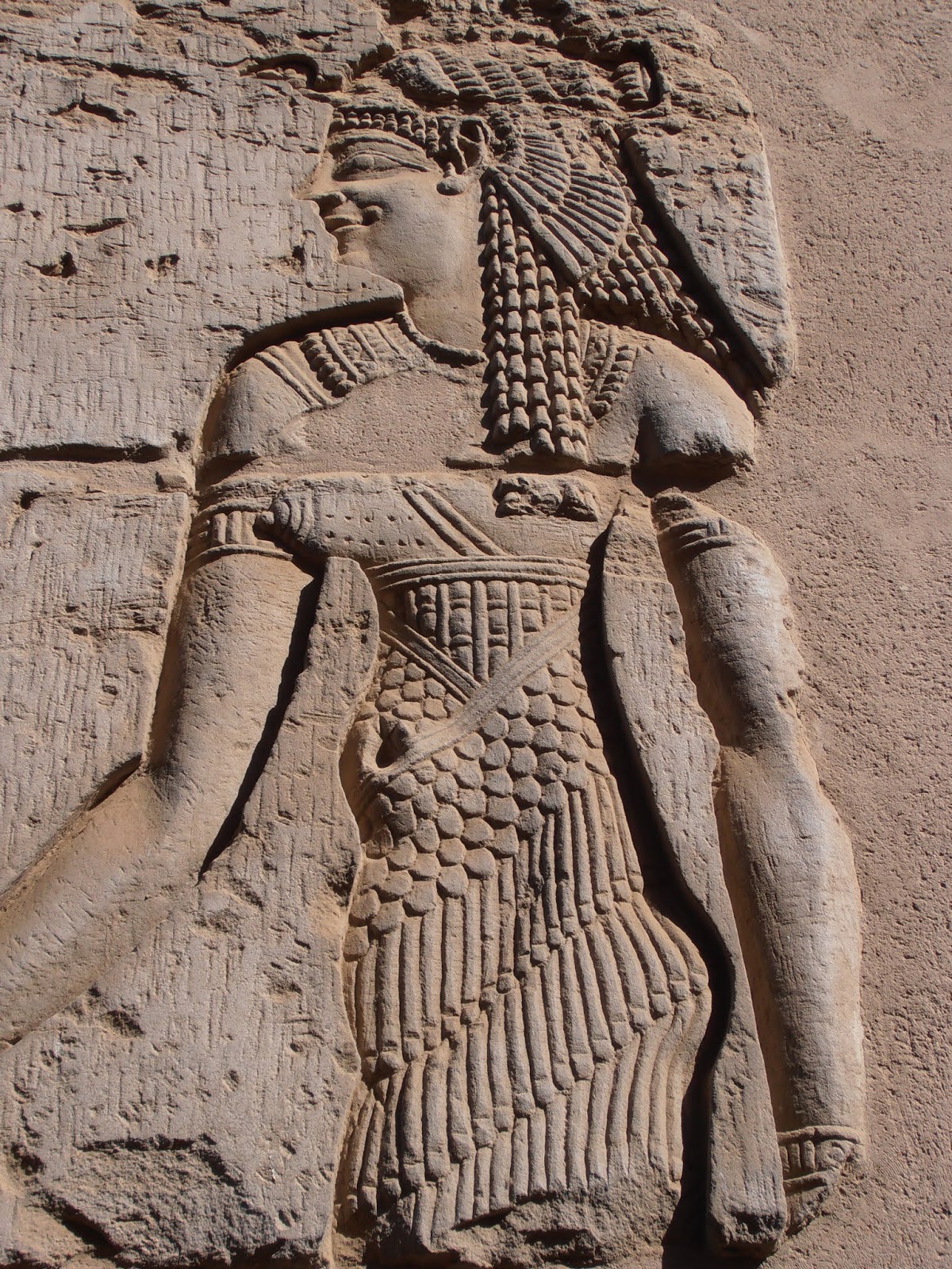
It was a glorious sun-filled day when we embarked upon our last excursion whilst aboard the dahibeyeh.  Kom Ombo is dedicated to the crocodile headed god Sobek & with the blue sky as back drop we wandered around the remains feeling as if we had stepped into the past.

Sobek became a god because for years the people of Kom Ombo were at the mercy of the crocodiles who plagued their waters.  There were many attacks & much grief so the point came when something dramatic had to be done.  The priests saw an opportunity & devised a plan...they invented a crocodile god to whom the people would pray for protection so the crocs wouldn't hurt them anymore.  The King was on side ( no doubt with a significant wealth oriented incentive)  people embraced this new god & brought him sacrifices, worshiped him & obeyed his orders (conveniently conveyed via the King).  Alas, it had no effect on the safety of the people, it did however increase the wealth of the priests!

I'm sure there is a lesson in there somewhere!!

To me it is a temple of crocodile heads, extensive & graphic hieroglyphs and pattern!


 Large relief sculptures were highly patterned, which reminded me of the popularity of zentangles. It also made me think of quilters & their use of patterning.


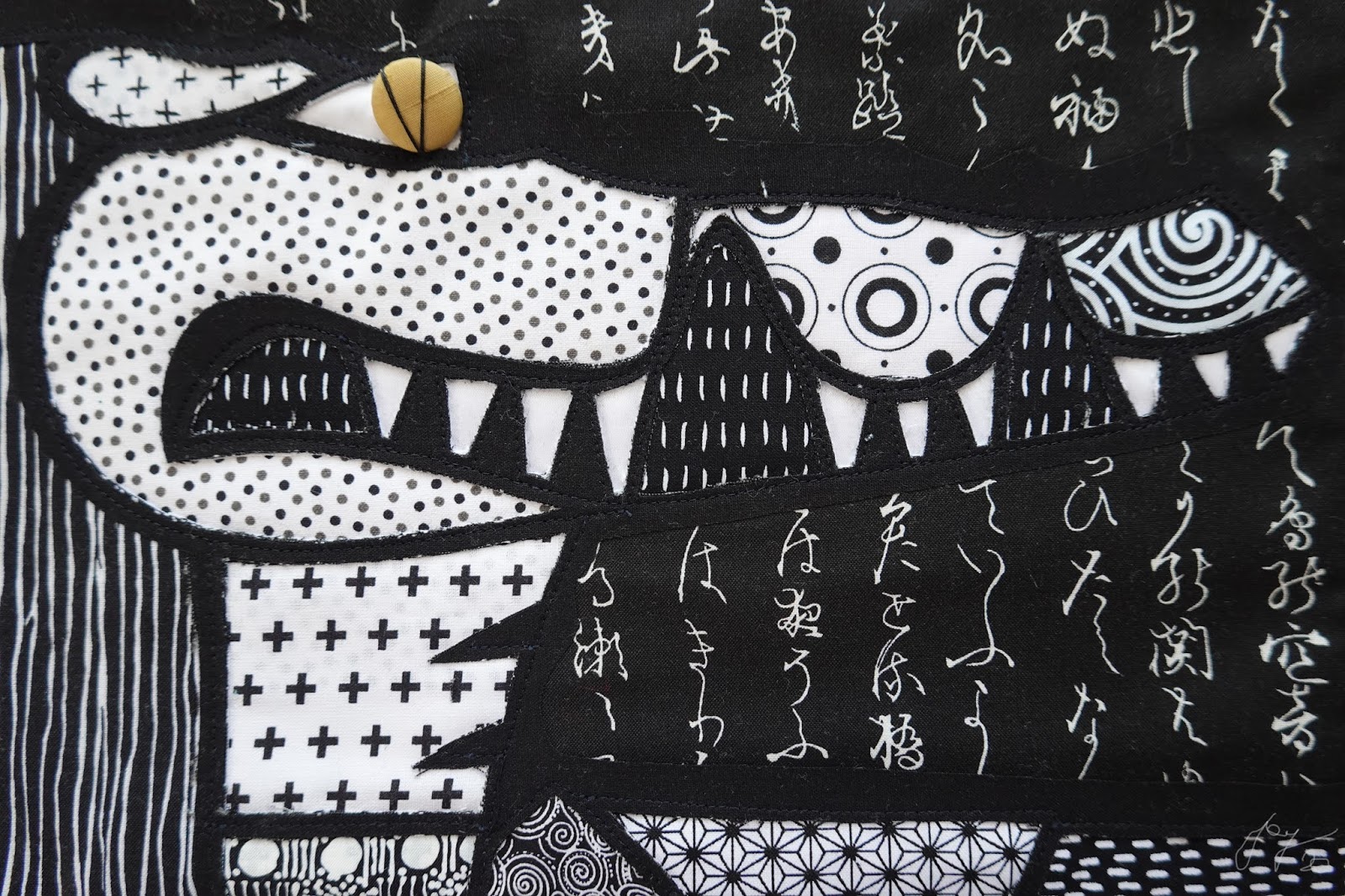
It was with those thoughts that I approached this weekly practice, starting at first with pen & paper as I got to grips with the proportions & shapes of my favourite Sobek head.  I soon discovered that with an A4 limitation, I was going to have to have a slightly disproportionate snout for my Sobek!


The next task was to go through all of my Kom Ombo photos and make a note of pattern variations.  I was thinking of taking that concept of zentangle & applying it to Sobek!


This would be a very good opportunity to use my stash of black & white fabrics, most of which have been sitting in the drawer for years!  I soon discovered that a lot of what I took to be black & white were actually black & pale grey, or black & off-white! Already a decision needed to be made about how much of a purest I wanted to be!!

Mixing & matching patterns is not my forte and it was a little overwhelming to look at all of these options and wonder where to start!

I decided to stick as close as possible to patterns that were similar to those I found in Kom Ombo, that reduced the pile quite significantly.  Slowly I started working out possibilities and placement.


With most of my art making using contemporary reverse applique, the fabric layers are all the same size.  To my mind this creates a more stable outline than having different thicknesses in different sections.
However, sometimes that ideal is not possible or not wise. For this piece I chose 14 different fabrics. To have them all cut to fit the whole A4 size of the design would be physically strenuous for my sewing machine & very wasteful of my fabrics, given most of them were only gracing one section of the design.  Therefore I opted for what I call the 'collage' method!

After tracing the stitching design onto the topmost layer (which would become the outlines) I pinned it up beyond the top of the design space, and began to lay the fabrics in place, lowering & lifting the top layer to check I had them in the right spot.  I needed to be mindful of where I put my lighter fabrics, because darker colours would show through them.

Then it was time to secure them in place with stitch & begin cutting back.  This is how it went...


I had reached this point, which I thought would be the end.  A neighbour had given me a number of no-longer-needed buttons & this was a perfect eye with the additional thread embellishment.
However, the mouth was bothering me, particularly the two triangular spaces between the teeth.  It then occurred to me that crocs usually have teeth coming up from their lower jaw, so although it would mean wasting that lovely fabric, I did a little more cutting back.

This is a more pleasing result, although it admittedly would look better if there were stronger black outlines around the two 'new' teeth.  I'm really pleased with the pattern choices, particularly the spirals at the snout & the aboriginal art fabric used for his necklace.

The toughest fabric choice... and one that may inspire some discussion, is the use of the Japanese style script as background. I do think we need to be mindful when we use the written form of a language that we don't understand & value for it's imagery as opposed to it's meaning, that there may still be those in our audience who could read the language & it may have an impact that we hadn't anticipated.  I've been in a shop situation where an item included Japanese writing as a decorative component when a Japanese tourist noticed it & identified that not only was the writing upside down, but it's message was one of bad luck.

In my case, the writing seems to be in the style of Japanese script, but I don't think it can be read. (I could be wrong of course!).  My use of it is to represent the hieroglyphs I saw during this Temple visit & quite frankly...this was the most perfect fabric to represent them.
He's a quirky Sobek & it was an interesting experience using so many patterns, therefore a very good day's work!!

Monday 3 February 2020

THE WATER URNS AND THE MOSQUE (Weekly art project #4, 2020.)

Another week, and another art project that takes me back to an inspiring time in Egypt.

This week my inspiration comes from a particularly memorable 5 km walk. 

We had disembarked from our dahibeya and stepped out onto a dirt track that took us past fields of crops where stork-like birds wandered picking off bugs & providing a natural pesticide service. With the welcome pleasure of shade from the date palms we continued on, identifying mango, banana, orange & dom trees scattered along the route.

Our wonder filled sojourn led us to a small traditional cafe, usually frequented by men only, where we drank down glasses of the blissful  mint infused black tea. Whilst sitting & sipping I looked out at this mosque. Immediately I fell in love with the rich colours & white decorative frieze at the top.

I was also enamoured with these beautifully shaped water urns that sat a few metres in front of the cafe.  I suspect their cool water has quenched many a farmers thirst as it would have the mosque attendees after kneeling at prayer.


With these two photographs to inform me, I took out a pencil & started a visual record of what I was attracted to in these images.  It is such an important way to study the subject. I definitely see more by the focus required in drawing.
There was a lot of information here to try & compose into a design!

I began by seeing what I could fit into a water urn shape.  After a few variations, I then rotated my frame to a landscape format & it was then that my ideas seemed to come together in a more pleasing arrangement.


For my colour palette I wanted to stay as close as possible to the mosque colours.  I also chose to include a brick patterened fabric because in between the white decorative feature   bricks were exposed & I thought using this fabric was a way of referencing them without having to actually replicate bricks in my design.


There was also a treasure I want to include in my project!

During the drawing process, I'd noticed the pole outside the mosque was covered in election campaign posters. This reminded me that I still had a little plastic bag of 'finds' from our Egyptian trip.  Each time I travel I keep my eyes open for some discarded treasure that I could use in my textile art making.  Sometimes there are buttons or lost earrings that make their way into my plastic bag, in Egypt though, one of the found items was the remains of an election brochure!

With my 'use your tools' mantra still quite loud in my head, I knew that the time to use this salvaged item, was now!!

For this design I made the decision to have two different 'outline' colours.  After cutting, ironing & layering up my fabrics, I stitched in the lower outline fabric. It is hard, at this stage, to discern what the outcome will look like!!


Carefully I lined up the upper most fabric to stitch in the remaining lines.

At last it was time to start cutting back & see how my ideas worked!  Here's how the cutting back went;

I was so pleased with how it all looked so far.  The white did feel rather loud, but I recognised that that was because of the red based colours I had surrounding it.

There was one finishing touch I wanted to add.  Time to get the paint & a very thin brush out!


This is the finished result & I'm very happy with it. 
There are a few changes I'd make if I was doing it again, mainly in regards to colour placement.   Overall though, this is a satisfactory outcome that instantly reminds me of that fabulous walk & how priveleged we were to experience it!
I am really enjoying getting back into this routine & can't wait to see what inspires me next week!  Happy creating.