Monday 25 February 2019

LIBATIONS IN THE AFTERLIFE (WAP #10; Egypt)

For us arty types, the flexibility of museums in the past 10 years in allowing visitors to take photos (without flash) has been a godsend!  At last we can snap away at everything that grabs us as being a resource for future inspiration.
The down side of this liberty is that when we encounter a museum that not only doesn't allow photographs to be taken, but doesn't have a decent postcard selection or even a beautiful book to purchase for reference, it is DEVASTATING! True wailing & gnashing of teeth scenario!!

Luxor Museum was like that.
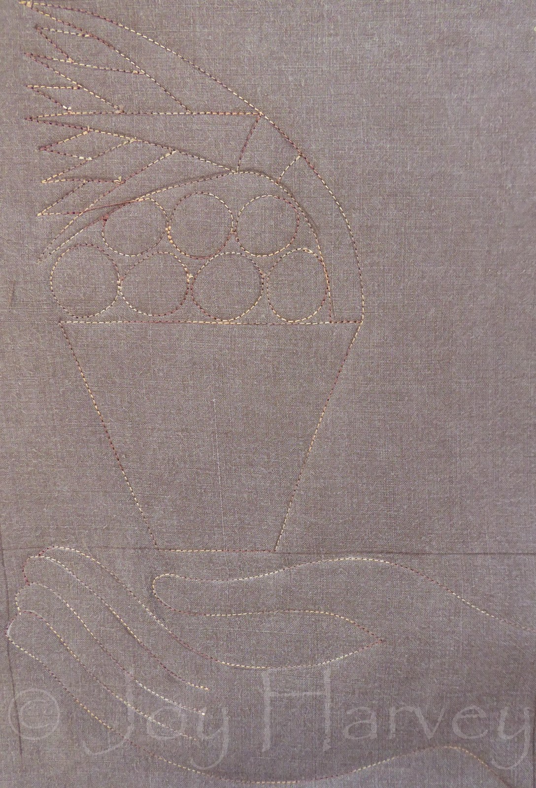
Enter the trusty sketchbook.
Well, maybe not so trusty.
In the Luxor Museum we encountered some truly extraordinary artifacts from throughout Egypt's history. Being a 'no photograph' museum, I tried to sketch & make notes of some of the wonders I felt so privileged & overwhelmed to be seeing.  Looking at my sketchbook now, I recognise that I didn't write enough notes! For example, when quickly sketching the shapes of the perfume & libation bottles that formed part of the internal decoration of a wooden casket, I would like to know if they were coloured, where they were placed in relationship to other decorations, were they repeated at several points around the casket or in just one spot?

Even without the answers to these questions, I chose to use this page from my Egypt sketch book as an inspiration for this weeks art project.


First things first, I needed to sketch each of those bottles in a larger format so that I could get a sense of their lines & form.  Then, I would choose a few to fit into my A4  project size.

Before proceeding much further, I also made note of some of the other patterns found in the casket & wondered whether they might be good to include in some way.
Taking advantage of the hot day (ie; quick drying time) I got out some acryllic paints & white calico to roughly paint up some patterns. 


While my paintwork was drying, I started to work up a design.  In the process of measuring & ruling I found myself really enjoying the extra line marks.  It felt like a Mondrian- meet-Ancient-Egypt moment! I decided to keep some of those extra lines in my design & consequently give it a modern twist.


I also chose to only use scraps for my colour sections.
Like many textile artists I have a lot of scraps!  They sit in my colour bins which I occasionally rummage through, but don't get to use nearly enough.  I keep thinking I'll use them to create scrap quilts, but inevitably, I never get around to it!
So...it was time I started using them more consciously & NOW was that time!!

This decision did make the selection of fabrics & layering them up process a tad more time consuming, but it was certainly a valuable exercise.


I love this moment, before any cutting back begins.  The design is stitched in & the top fabric hides so many possibilities beneath it!


Unusually for me,l I chose to cut the negative space away first & absolutely LOVE the black shapes with the white lines against that patterned background.  It was tempting to stop right there & not cut back any further...


...but I did.
By cutting the first layer to create the outlines, it is interesting to see the rather modernistic way the layers appear before they are cut back further to their designated sections.


This is the final result.
I'm not sure why I chose to make gold crosses in each of them, I think I just got a bit gaga with the gold!  Looking at it now, I may go back & cut some of the gold out.
For me, much as I love the colours, this is a bit too visually loud for me. I actually prefer it in the black phase.
I wondered whether it might have looked better with less colour intensity in the background, so I took a black & white photo to see how the tonal values were balanced.

As you can see, they are actually balanced pretty well, which is a relief!!
Although I'm not as happy with my colour choices, I am happy with the design & enjoyed doing this weekly art project very much.
On a side note, there is a new book about Luxor Museum coming out this year & I am now on the waiting list to purchase one.  At last I will have a much better resource with which to remember our visit to this wonderful museum.  Yeehah!

Monday 18 February 2019

AN OFFERING (WAP; Egypt #9)

Throughout our time in Egypt, we were fortunate to visit many temples & I noticed that I instinctively developed an interest in specific characters, motifs and subjects whilst exploring them. 

 One of my favourites were the depictions of offerings to the various gods. And part of the attraction was the way the hands were styled.
I love those long fingered elegant hands!

So, for my last art project inspired from within the compound of Luxor Temple, I chose to focus on an offering. However, of the offering themed photos I took in this temple, the one above is the only one in focus! It is another that I have based my project sample on.


Copying is such an informative process!
Those beautiful hands may be simple in style, but that simplicity is gained by a careful arc  and placement of gently flowing lines. I did wonder if the original artists had a template to follow, or whether they chose their own variation of the hand theme.

Having worked on the hand first, I realised that I wasn't going to have much space for the Lotus pot offering, so I was going to have to move that hand down the composition. 
Not wanting to waste paper, & knowing that I'd be tracing my workings onto another paper to form my pattern guideline, I worked out the proportions of my lotus pot up in the top half anyway!


Once the actual design was complete, I gathered my pencils for an exercise in shading.  I wanted to give this offering some dimension, & shading was the way I could learn where different tones of fabric would eventually need to go.


In search of a background for, what I intended to be, a plain foregound, I came across a curtain sample which looked perfect.  It also blended well with the stone toned fabrics I'd found. It is always a bonus when fabrics come together happily without making me spend all day looking!!!

  As I was rummaging through the fabrics, I thought I'd pop a bright colour in, then cut it back so that only a slither was showing.  The effect I wanted to achieve was the idea that the lotus was once painted & over time that colour had worn away so that only fragments remained. This splotchy pink looked as if it would work for the effect I wanted.


Ironed & with each layer in place, I sat at the sewing machine to sew in the design.  The top layer, which will form my outlines, is an old linen skirt that I absolutely loved.  Alas...my girth has increased & I can no longer wear it, but...the colour is perfect for this & it is wonderful to give it a new life.
I've used a variegated thread, which I just LOVE! It adds another layer of interest to the visual outcome.

Enough admiring the stitching...it was time to let the cutting back begin! 
Here's how it went...


To complete the piece, I appliqued on a thick line to represent a tray.  I chose to take it to the edge of the piece to give the impression that we were seeing only part of something bigger, there was more going on off screen! This also supports the direction that both the hand & the lotus are facing. 
You'll notice that I..ahem...didn't end up cutting back the pink as I had initially intended to. This is because I REALLY liked the way the pink looks as it is & felt it gives a good lift to what might otherwise be perceived as being a bit dull!!
The background fabric is perfect.  I love the movement & energy of it.

All in all a very satisfying art project this week. Next week, I'll venture beyond this temple for inspiration, but I have LOVED revisiting through these past few weekly art projects.

Sunday 10 February 2019

TEXT & TWEET (WAP #8; Egypt)


The Luxor Temple site was fabulous to explore, not only for it's Pharaohonic remains, but also the evidence that the site has had various reincarnations throughout the years!  It was used by Alexander The Great at some stage, it has been a Roman Camp & in more recent times a whole village has resided within the walls & pillars of this site. 

In a well covered corner we caught glimpses of coloured plaster work showing part of a scene that clearly had nothing to do with Rameses 2!!


In amidst all those 'jigsaw puzzle' blocks that I referred to last week, I found these two precious discoveries.  They were so very different from the ones decorated in the recognizable style of temple relief work. They definitely intrigued me.

Therefore, I chose to use them as my inspiration source for this week's art project.


Before anything else, I decided to prepare my background.  It was here that I sought to refer to the stamped marks in the first block.
 In my stash I had come across an old paint cleaning cloth, well encrusted with paint, smudges & splotches.  Building on the texture it already had I stamped a few more linear marks in black until I was satisfied that I had an interesting background that could be interpreted as some form of language.


While that was drying it was time to think about the bird.
I love this little bird motif!  It is so stylistically simple, yet still a charming character!  It took me a bit of time with the pencil to get my lines proportioned satisfactorily!
What was I going to do about colour?
With such a busy background, I knew I had to keep the colour relatively plain & solid.


Once my choices were made, I checked that my range of fabrics had a good balance of colour value by using the black & white app on my camera.

After ironing, layering up & then stitching the design through, it was time to let the cutting back begin.


 The two blue fabrics I'd chosen were hand painted pieces, one slightly lighter than the other.  That effect was EXACTLY what I wanted, as it gave the bird more detail & interest, without distracting the eye too much with the visual noise of another contrasting colour.

 The original stone relief has another outline around it, so I thought I'd cut back the fabrics to allow a shallow border of the blue to be visible.  I'm quite happy with the result. It added interest & it's a bit different!!

With the addition of a few lines & colouring in with the gel pen my little bird was complete!
I am very pleased with this outcome, and I'm glad my choices haven't detracted from this little bird's charm! 

Monday 4 February 2019

SNAKES (WAP; Egypt #7)


I'm not a snake person!
Whether it's because I didn't grow up in a country where snakes thrive or because it's 'just me', but I find them visually unappealing, somewhat scary & their tendency towards slithering puts shivers up my spine. Ergh!


Except these snakes!
To me...these are beautiful, even if in snake form.
In a section of the Luxor Temple complex is an area covered with 50,000 blocks that all have parts of a sculptural relief or hieroglyph on them. All retrieved from elsewhere, from when they were recycled during medieval times into the homes & buildings of surrounding areas. These blocks are slowly & methodically being sorted into the time period they would have come from, scanned, numbered & with the help of computers being SLOOOOOOOOWLY reunited with their fellow parts!This is the ultimate jigsaw puzzle!

Representing Wadjet & Nekhbet, ancient goddesses of Upper & Lower Egypt & known as the Two Ladies, these reunited blocks are the inspiration for my first weekly art project of 2019.

I knew I wanted to reproduce them as accurately & completely as possible, at least in linear form. Naturally then, I needed to get my brain & hand working cohesively to identify the lines needed to represent those shapes, so out came the sketch book!
Whilst sketching & looking more closely at the photo I was working form, I also made note of shading & then noticed some sections of colour still apparent in the carved grooves of the stone.  That fragment of colour would guide me in my choice of colour palette and fabric selection.


Once happy with the snake design, I drew it to size on a piece of A4 & then, because I also wanted to include the aged & damaged blocks in my art piece, I ripped the paper into sections.


The plan was that each individual section was a seperate entity & although stacked with fabrics of the same colour value, not all the fabrics would be exactly the same. After ironing, stacking & sewing the design for each section, this is how they looked.

It was time to let the cutting back begin.  Here is how it went...


Each snake fragment was stitched onto a different type of calico backing. One was stained, one had been washed & was soft to work with, one was unwashed so was quite stiff and the last was a heaver weight calico, almost as thick as canvas. The white fabric was intended to add some highlights to the sculptural effect of the snakes.  At this stage the plan was to stitch each section onto another background, but I had to find a background that didn't detract from the snake motifs, that provided sufficient contrast & had a bit of texture.


It took a while, but eventually I found the perfect backing!
Each of the fabrics used had come from my scrap bins (except the final background), which added a challenge to the fun of bringing this project to life.  I'm very pleased with the outcome, even if, compositionally, it would have been more interesting to have my block breaks in a less central location! 
This has been an enjoyable way to get back into the weekly art project routine & I'm already looking forward to what Egyptian memory might inspire my creativity next week!