Monday 27 February 2017

WEEKLY ART PROJECT # 21; GETTING BOLD WITH DESIGN!

Whilst watering the pots this week, I noticed that one of the succulenty plants was flowering, so I whipped it onto the courtyard table, so that I can see it more frequently.  Having it set with the black seat cushions forming a backdrop behind worked wonderfully at highlighting it's red colour.

I moved it to yet another location to sketch & here, I was struck by the shape of the negative space inside  the cluster of florets. The leaves were also intriguing, they meandered all over the place & were quite fleshy & solid.

Finding it hard, from the position I was in, to work out a pattern or rhythm to the leaf placement, I chose to select a small, somewhat abstract 'window' of the leaves & took my design process from there.

One sketch led to another, as processes tend to do...& each new step was fun!


The point came to start playing with colour & eventually a design I was very happy with emerged. 

Using a minimal colour palette this time, I layered my fabrics up & began stitching the design into them.

Usually, the top layer of fabric becomes the main outline for each part of the design.  This time however, I was keeping the negative space black, which meant I wasn't cutting back to leave an outline.  So as to prevent myself from reverting to form, I added a squiggle to the ONLY parts that needed to be cut back.


I love the bold design & way this piece flows. I could have left it there, but decided to go ahead as planned & add some stitch.

In my initial sketch of this plant, I had particularly liked the  linear representation of the florets, so wanted to keep that in. My  plan was to complete the stitch in black...then I wondered about green...and because I couldn't decide, I went with both! I think it was a good choice.

I am VERY happy with this result.  I love the contemporary, bold look of it & the way the focus is geared towards the stitched flower.  Part of me would like to try this again....BIG!  This is so very different from my usual style of work...I think I'm a little infatuated with it!


Monday 20 February 2017

WEEKLY ART PROJECT #20; BOOBOOK

Something very exciting has happened in the past week...a Boobook owl flew through our yard!  It was one of those rare occasions when we were out on the front porch, drinking peppermint tea, it was darkish & then, all of a sudden, in the glow of the street lights we saw the Boobook owl sail into our world.  We recognised it as a Boobook, because a few nights earlier we had seen one whilst walking around the block.  At that time it had landed on a nearby tree & we carefully tiptoed closer to see it's markings. At the time I did suggest it come to our house, and I am delighted that it listened!

I don't think it lives on our property, but it has definitely visited & that's good enough for me.  Such a thrill deserves a place in my weekly art project...besides...it's nice to have a change from plants!!!!

Not having been able to take my own photo of the Boobook, I had to use our big Bird Book as a visual reference. I first copied from the book.  Copying from another person's art work without permission is a no-no, but is a good way to observe the form and placement of lines & colour.  I then copied my copy (!) onto fabric using paints.

Although I don't consider painting to be part of my skill set...I am very pleased with this little cutey! The fabric I used was already backed with vliesofix & I had taped it to a solid background to keep it taut whilst I was painting.

Neither of my copies is exactly like each other, nor the book & I like that uniqueness.

I needed to put my Boobook ON something & that 'something' needed to be able to be produced in contemporary reverse applique.  The obvious choice was a tree branch with coarse looking bark.

A quick sketch gave me a guideline for colour, line & how I was going to place it within my 15 cm square.

Once a stylised linear pattern had been drawn up, I needed to look at fabric choices for my tree.  Having the Boobook there helped me to make sure that the bird would blend in with the bark colours.

After cutting back each of the layers & cutting out the Boobook, it was time to experiment with where I wanted to place this little owl.  Would I put him here...
...or here...
...or maybe here?

Once settled upon the ideal spot, I ironed him in place & added some machine stitch & a couple of black beady eyes to complete the picture.

I am very pleased with this little pictorial piece, partly because it is quite different from my usual way of working. I acknowledge that he does look a bit out of proportion, but he wasn't a big owl & I did choose a very thick bough to put him on!!  Regardless, he is a delightful addition to my garden inspired book of weekly art projects & a good way to remember the visit.


Wednesday 15 February 2017

THE MAKING OF AN ART PIECE

On Monday morning my facebook feed included a youtube clip of Annie & Lennox & David Bowie singing Queen's 'Under Pressure' song.  Let's just say...PERFECT soundtrack for my day!!  I needed to finish an art piece, make sure it was dry (because I was using paint), stretch it over a canvas & attach appropriate hardware, because it was due to be delivered to the Royal South Australian Society Of Arts the next morning for an upcoming exhibition.

This whole piece had been a somewhat last-minute full-on go-for-it artwork, as I had only started it the week before, which is when I realised that the delivery date was THIS week! Honestly, the weeks whizz past so quickly I often get confused as to which day it is!!

The exhibition is entitled 'Winds OF Change'. I LOVED that as an exhibition title & I wanted to include something new in it.

Contemporary reverse applique is very labour intensive & generally takes me a lot of pre-planning time as well.  So WHAT was I going to produce in less than a week, suiting the theme & of appropriate quality for a Fellow of the RSASA to submit for exhibition????

I decided to revisit an old friend.  If you follow me on facebook, you will know that a few months ago, I completed the above piece as a part of my weekly art project.  It was inspired by my love of leaf shadows on tree bark & one of our trees was going through a particularly colourful bark transformation at the time, so I HAD to record it!  I have been ruminating for quite some time, whether to try a larger variation of the piece, which, as it happens, I had particularly enjoyed doing.

Without too much over thinking, I decided to... just go for it!

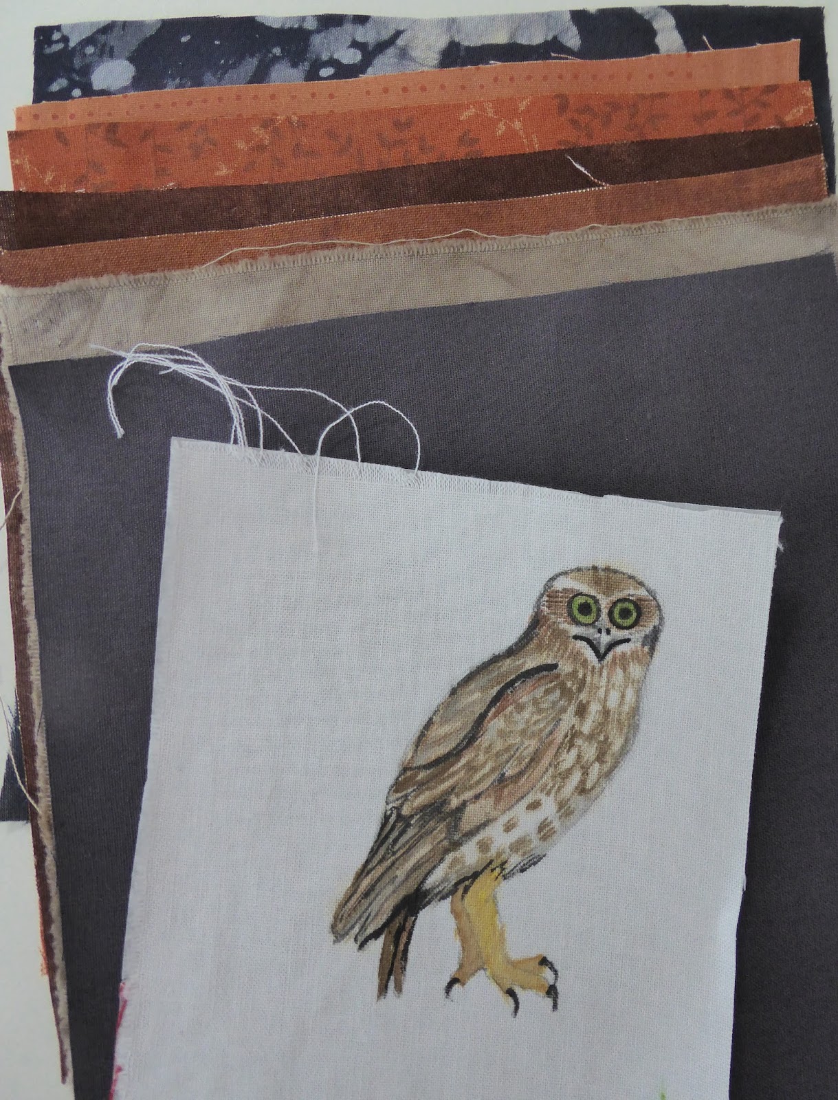
I hurriedly printed off some of the process photos from my earlier project, as a guide source, and photos of my tree as another colour guide.

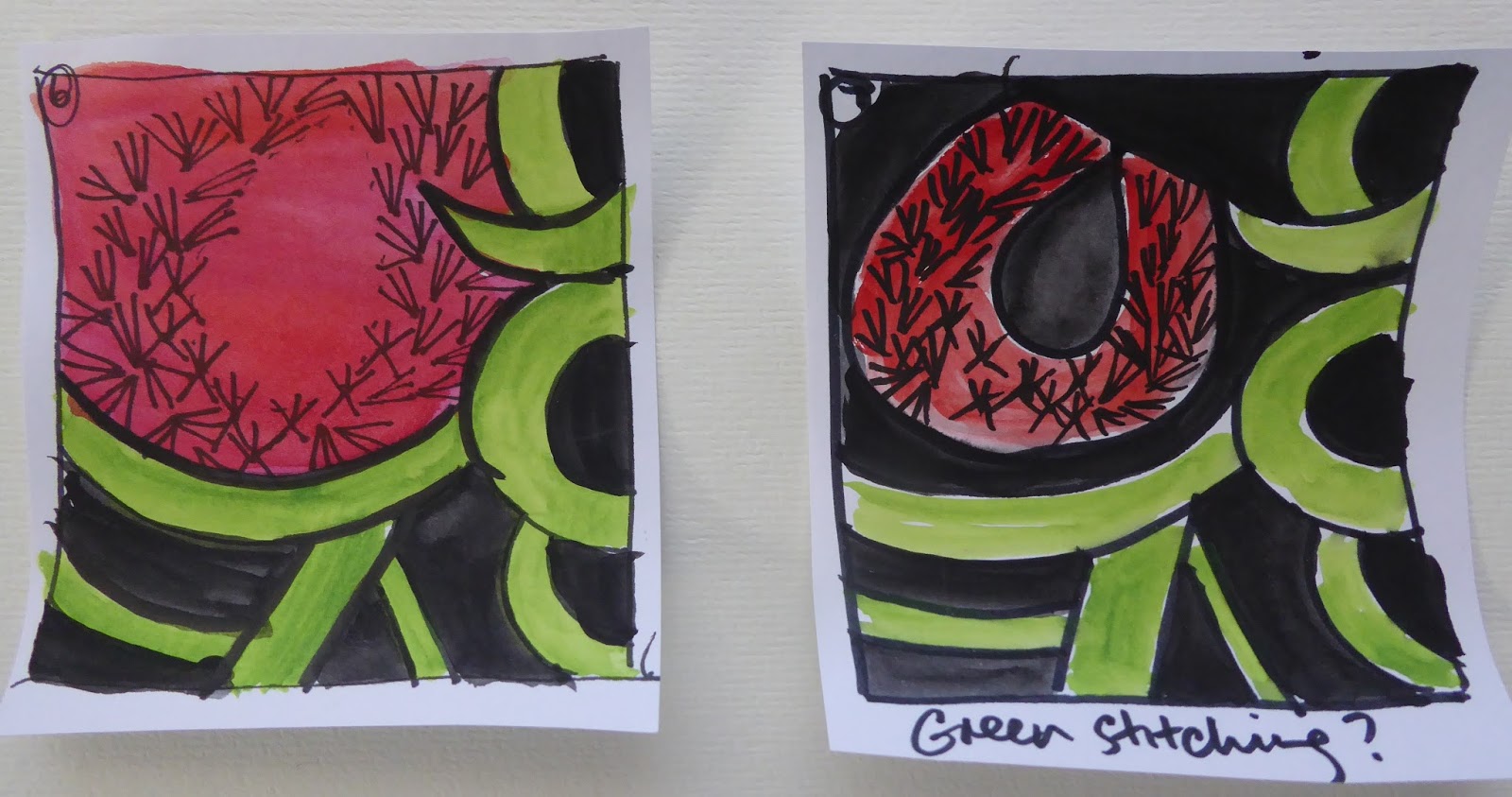
With an extremely quick felt pen sketch & an equally quick sort-of plan, I began.

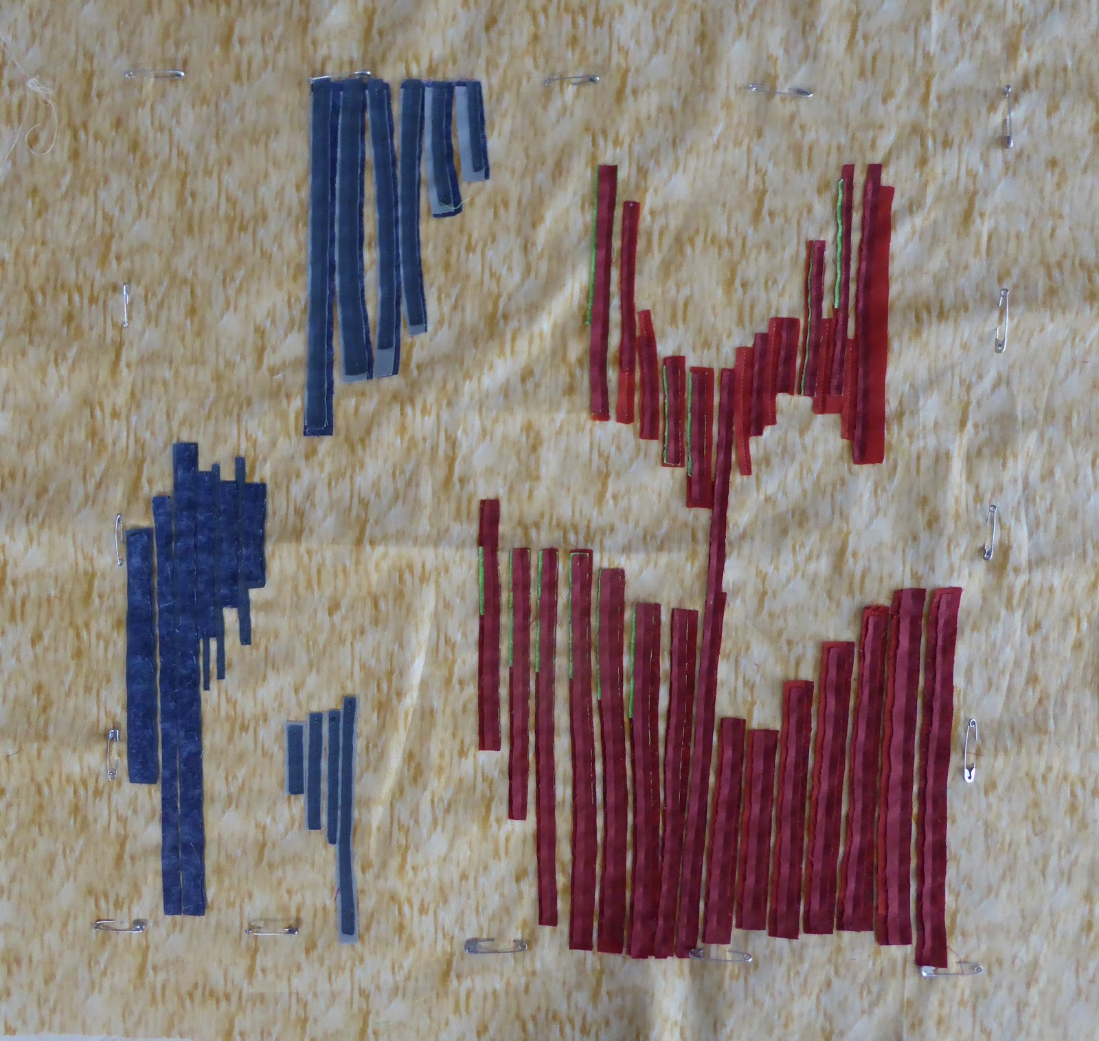
This particular style of work is very instinctive.  After choosing my colour palette of fabrics, I spent a LOT of time making decisions about blocking spaces with colour 'sandwiches'.  This means I wasn't just sewing on one layer of fabric on at a time & cutting back (as it may appear to be when you see the photos), but each sandwich contained 2 -4 layers & each layer was well thought out insitu!

Enough talking, let me show you the way it progressed...


As if the deciding, sewing and cutting back weren't enough to cope with, I was also doing this in my workroom during a heatwave & without air-conditioning!  It was definitely messing with my mind at times!!

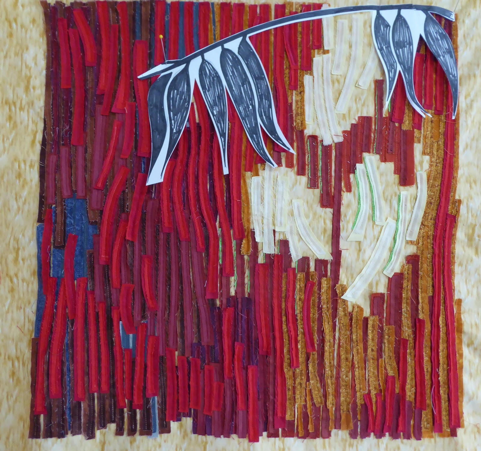
 Once I'd reached this point, I needed to work out where to put the leaves!


The white paper just wasn't working for me, so as an aid to visualizing how it would all look...I coloured the leaves in, before playing with placement options again!


During the process I had added & subtracted various leaves & changed a few positions. 

FINALLY...I made a decision & transferred my leaf design onto freezer paper for the stencil.


During this process I had to come to terms with the fact that this could be one big (50cm square) disaster!

But it wasn't!

It is not perfect & I certainly wouldn't do a few things the same way again, BUT...I love it!

 This is 'Leaf Shadows On Tree Bark' and it has made me one happy little artist! Because I usually do so much pre-planning & thinking, trusting my instincts & trusting myself are not areas that I am very confident in!  After this, I just want to try doing more of this style of work. Woooohooo!


WEEKLY ART PROJECT #19; LAST LOOK AT THE AGGIES!


I think I picked the last perfect agapanthus flower left in the garden for this week's art project study.  It is so delicate & the beauty of the individual flower gets lost when we look at the agapantha head as a whole. I love the placement of the stamens, the way they sit low in the centre of the flower.

The rest of my aggies look like this...

 I decided therefore to incorporate both in this week's project. Being short on time, I didn't spend too long thinking about how I could represent these two images together on textiles, I went with the first idea that popped into my head & proceeded with minimal planning.

Thinking of the background first, I wanted to produce a stylised version of the head of green pods, so played with a few ideas with pencil, before blocking in my chosen design with pen.

The next step was to cut out a stencil from a scrap of freezer paper I had left over from another project.  Having drawn up a grid on my background fabric it was time to get the stencil brush out & start! I  happened to have some left over grey paint, so adding more white, I used it to create a repeat patterned background. I was very happy with the result & I was very relieved that that scrap of a stencil lasted 9 rounds of paint application!  It was definitely ready for the bin after that though!

Whilst the background was drying, I whipped up a few quick sketches of the floret & settled on a profile design.

I cut out a copy of it to trace around on my 'map' (pattern) to see where it would work & where it wouldn't!!

After choosing some fabrics, it was time to sit at the sewing machine.  Although there was very little actual stitching needed for this piece, I was using a cotton that was a contrasting colour to the fabric it was going into, therefore I needed to be careful to stay neat & straight!

Cutting back is where the fun starts & the first cut boded well!

Second & third cuts left me with a cute little floret that I was happy with.  I didn't cut back the green at this point for two reasons; 1) It was needed for the stems of two florets 2) I still needed to stitch the stem outline in!

Carefully placing my 'sandwich' of fabric layers, I stitched in the next floret.

Then the process of cutting away began again.

The stems were drawn on with an air erasable pen before stitching in place & cutting back.

With the addition of some beads to pep it up, here is the final result.  In hindsight, I would have preferred the grey stencil to be a little softer, so that it receded into the background more. I obviously didn't put enough white paint into the mix!!

Otherwise, I am quite pleased with this result, especially given my restricted time.  I think I have now finished with the 'agapanthus meets contemporary reverse applique' experiment.  Next week I'll find another source of inspiration from my garden.