Monday, 30 April 2018
THE MARKS THAT MAKE LANGUAGE (WAP# 15; ISTANBUL)
During this past week, our usual routine was paused as we stopped to remember & respect Anzac Day. In our household we have developed an Anzac Day tradition of watching Russell Crowe's film, 'The Water Diviner'' as a means of reminding ourselves about war, it's consequences & in particular what happened in Gallipoli.
The film is painfully graphic in it's portrayal of the horror of war, but balanced with scenes of absolute beauty in the way he represents Instanbul during that time. It is as if the exotic paintings of the Orientalists have come to life on our screens. It is also wonderful to gasp with recognition at some of the locations.
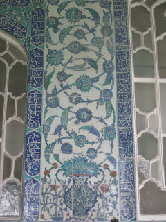
Therefore, it was with added pleasure that I approached my weekly art project this week as I, once again, recognised how fortunate I have been to visit this great city. Being the last Monday in April & with all my April art projects having been inspired by the tiles in the Topkapi Palace, it was to these that I returned for inspiration this week.
In particular, the tiles which are patterned with Arabic script.
I mean no disrespect when I use the word 'pattern' & 'script' in the same sentence. To my way of thinking, the written form of language is no more than a series of symbols & marks that when put together in certain combinations form patterns that we then recognise as words! That's if we are conversant in that particular language of course. If we cannot read the written form of a language then it remains a meaningless pattern of symbols/marks. This doesn't mean a lack of appreciation though!
I cannot read or speak Arabic, which means that when I look at Arabic script I don't see 'words', I see a beautiful combination of flowing lines.... and I am spellbound by it!
Throughout Topkapi Palace there are tiles of Arabic script over doorways, as filler inside motifs, in long rows amidst the patterned tiles...
... and as borders to floral panels.
Where to start in my own script study?
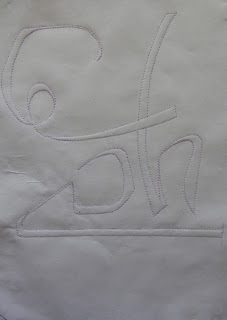
Gathering together the photos that showed Arabic script, I looked for particularly interesting combinations of line & curve & tried to copy them down. The fact that my copying is not perfect highlighted why calligraphers take so many years to master their craft!
When the page was full of small studies, I coloured in all the enclosed spaces with turquoise. I find this page truly inspiring just as it is! However, to create an A4 sized WAP I needed to make a few design decisions. This proved to take an extraordinarily long time. In all honesty, I wondered whether I'd actually complete a project this week!
It was proving so hard that I resorted to 'shaking things up' a bit! I got out the tracing paper & copied down my favourites. Because the paper is see through, I could layer them on top of each other, move them around & upside down in that search for something to grab my 'uh-huh' attention!
At last....after approximately 5 hours in the workroom, I had something I was willing to work from! I chose to have two outline colours. Therefore, I layerd my fabrics up from the base to the one that would be the 'underneath' outline. Using variegated thread I sewed the lines in.
Then on went the top outline fabric & again, I moved the sewing machine needle around the carefully drawn lines of my outline.
Then it was time to let the cutting back begin....
With only 4 colours in this design, the cutting back didn't take too long. I was very pleased with how this looked. However there was just one more touch I wanted to make.
By adding a touch of white to the diamonds using small beads, I feel that both layers of script are now more connected.
I'm very pleased with the outcome, but before I finished for the day, I gave my newly completed WAP the 'Layout app' treatment. These are the results!
This vertical repeat pattern has great potential as a border. In fact...I'm tempted to play with it further towards that end.
This design involves flipping the image & repeat patterning. Again, a very effective outcome. I particularly like the interest those background lines add to this option. It is also interesting how a slightly darker area of lighting creates more interesting areas of depth. I am sure that there are better & more sophisticated ways of creating patterns from single designs, but I have been having enourmous fun with this app & it has opened up many more options as to how a single design motif could be used within textile art making.
Well, that's April done & dusted. May WAPs may be somewhat fragmented as I am about to go travelling again. So...until next time...happy creating!
Please respect that all of the photos above belong to me. Please do not use them without my permission. Thank you. JH
Subscribe to:
Post Comments (Atom)


No comments:
Post a Comment