I'm back in the blogosphere! Yay!
Having not completed a weekly art project for several months, I recognised that I had a perfect opportunity to leave things as they were, accept the natural progression & not resume the practice at all.
However as I sat down to review my art making in the past year & look ahead to this year I realised that I missed doing this each week. I missed starting my week with art making that was inspired by wonderful travels rich in memories, yet was purely about practice with the added challenge of writing about the process.
So here I am again.
Last year my weekly art projects were inspired by travels in Egypt. Due to a death in the family I wasn't able to complete all that I wanted to, so have decided to resume with the Egypt explorations this year.
This first 2020 project takes us to a site up a dust track through farmland, past camels, buffalo &
sugarcane into the cave tombs of Al-Kab. These tombs are unusual
because they are on the EAST bank, usually tombs are on the west,
because the sun sets in the west. The ancient Egyptians believed in
eternal life. They believed that man was like the sun; weak when it
arose (born), strongest in mid life & getting weaker again as it
sinks into the west (heads towards death). The analogy continues, that as
the sun rises again to a new day, so too does man. Al-Kab chose to put
their tombs on the East bank because their location was very susceptible
to flooding & they wanted to protect the tombs. We were able to see four tombs of Noblemen and each was exquisitely decorated.
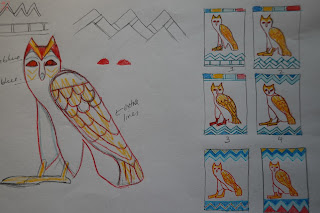
In one of those tombs was this wonderful yellow owl with red outlines.
Art making is, in part, about decision making.
It was all very well for me to decide that I wanted to try reimagining this owl using textile processes, but what was I going to put with it?
How was I going to frame it within a meaningful context...or even a decorative one?
And then how was I actually going to represent this owl using contemporary reverse applique?
When I'd entered this particular tomb, my mind had been overwhelmed with information. Not only were my eyes trying to take in the motifs in hieroglyphs and relief paintings, I was recognising the images that hit my own personal 'Wow' factor & I was also trying to listen & inwardly digest the information the guide was giving us. That is a lot to take in within a limited time frame & in low light! I took quick photos of the parts of the tomb that made my heart sing, but didn't necessarily take photos of the bigger picture of how & where they fitted with everything else.
Therefore I had minimal data to inform me about this owl. Eventually I decided to keep it simple & just use the ^^^^^^ symbol on the bottom left of the photo. It represents water, which is appropriate for a tomb trying to avoid flooding!!
One of the aspects I wanted to try & represent was the sense of age . I was attracted to the deterioration of the plaster wall & wanted a textural background to represent that.
I chose to use a loosely woven curtain sample, which I then applied printing ink to in a random fashion. The sponge roller gave a gentle coverage, which I really liked.
It needed stronger areas though, so I applied more with a brush. This created the effect that I was looking for. With temperatures heading towards 35 degrees celsius, I knew it wouldn't take long to dry!
I found fabrics for the other parts of the design, ironed them & then stitched the design through the lot!
I cheated a little!
I didn't have enough of the darker blue to cover the whole A4 area & no other blue would do. So, with careful placing & separate stitching I made use of the smaller pieces to frame the top & bottom. I was now ready to start cutting back.
It might be hard to believe...but I felt nervous!
The red was cut back to reveal this wonderful mottled goldy yellow.
I loved it just as it was. Surely it wasn't necessary to keep cutting back?
But I did!
I held my breath as I started cutting back to the background. Would those solid colours be too strong against the textured background?
I was very pleased with the owl, but felt that the water frames were just too strong & to be honest...they were boring.
It was time to get the embroidery threads & beads out!
This is the finished piece & I am very pleased with the results.
The embroidery definitely makes the water more interesting without detracting from the owl.
I'm delighted with most of the decisions I made about the owl. When studying the photo closely I'd spotted the pale blue hidden within it's features & am pleased with the way I've used it here to connect with the water.
A very pleasing start to the new year & a new week!


No comments:
Post a Comment