Monday, 29 March 2021

ALCAZABAR (WAP # 11, Inspired by The Alhambra)


As I sat down to contemplate my art project this week, my head was full of war.  I'd seen the French film De Gaulle the night before & my current audio book is set in an Apocalyptic future when civilization has disintegrated, so it seemed fitting that my muse would be the fortress at the far end of the Alhambra, the Alcazaba.

Built in the 13th century and located to give itself exceptional views out over Granada, this military base was in a very powerful position. Although there are towers & ramparts and a garden to see on this site, for some reason I only have two photos to remember it by.  The above is of Plaza de Armas & shows the remains of the military quarter.

I can't help but think that those neatly finished building remains look like a street map.

That in turn makes me think of people...not just military personnel, but all people.


The second photo shows a cache of canon balls. Instruments of destruction and death to people whether innocent or enemy.

Somehow I wanted to combine these two powerful images as symbol, and put them in an arch.  Paper & pen came out, drawing began, an idea started coming together.


I started with my 'barracks' street map & after stitching the lines, it was time to start cutting back.


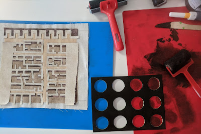
Once cut back I wanted to layer some canon balls over those street-map-like lines.  I could have sewn on another piece of fabric, stitched in some circles & then cut back some more, but I wanted a different sort of effect.

I cut out a stencil from a foam sheet, but instead of applying paint to the positive circle shapes, I rolled it onto the negative space of the stencil & used it as a stamp on top of my carefully cut out fabric. It was a little nerve wracking, but I was happy with the results.


I like the variation in intensity of colour & the fact that I can still clearly see the cut out relief of the barracks using contemporary reverse applique.

I wanted to  enclose that in an archway. I like archways & there are a lot of them on the Alhambra site. For me they represent something of the sacred.

Because I'd tried to use a colour palette close to the reality caught with my camera, I chose a soft terracotta fabric for my arch & stitched it on, adding quilted lines to signify brick work.  Once complete it was time to cut back for the big reveal!!


Here is the finished outcome and I am very pleased with it. My eye is still drawn to the central panel of canon balls & barracks, even though I've framed it with quite a contrasting colour. Visually it is very pleasing.  Symbolically though...what am I trying to say? My canon balls are empty of paint, therefore they haven't caused destruction to the barrack map representing people. But the negative space has. One could interpret that negatives kill then? I  want this to suggest that life is sacred. For now that sits well with me & is enough.

Next week is Easter, so I'm not sure if I'll manage to get to my workroom for my weekly project, but when I do, it will finally be time to head to the Nasrid Palace. Be still my beating heart!




Monday, 22 March 2021

MISTAKEN IDENTITY (#11 Weekly Art project; The Alhambra.)


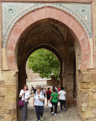
One of the oldest structures in the Alhambra complex is the Wine Gate. This ancient entry into what would have originally been the higher section of the Alhambra is visually dramatic with it's red brick arch & glazed decorative work.

Walking through the thickness of it's walls to the other side reveals one of those magnificent key symbols.

When we visited we wondered why it was called the wine gate when the Moors were Muslim & therefore didn't drink wine. We assumed that it referred to the wine colour of the brick, however, Mr Google has told me a different story!

According to legend it's name is due to a mistake (although no one seems to know who made the mistake!!). The gate was supposed to be called Bib al-hamra meaning RED gate, but one single letter changed that! It became known as Bib al-jamra which means WINE gate! I'm sure there must be a whole lot more to the story than that, but it wouldn't be the first time that a small mistake made a big change to the way something is perceived from then on.

Such an interesting structure & story captured my imagination today as I sought to create a response in my weekly art project.


As with last week, I sat at the computer today, zooming in to look closer at the photos we had taken & drawing the elements that most interested me. In the process I discovered that the glazed decorative work included more than one colour.  As well as blue & turquoise there was a pale mustardy gold in places too.

In choosing how to proceed with design development I asked myself what were the important features that I wanted to express.  They were the red arch, the blue & turquoise colours & the key.

With what I was going to try & produce, I needed three different outlines.  This required careful pinning & concentration as each layer went under the machine one atop the other.


At last it was time to start cutting back.  This is how it went...


Thus far, it was how I was expecting it to look, except perhaps for the middle section with the ikat motif.  I initially chose it because the motif was very similar to one of those decorating the glazed panel. It certainly added intrigue, but I found it distracting.  It was time to produce the key & see whether that would improve the overall composition.

I wanted the key to be loose, so that it moves, so used some very thick iron on interfacing to give it support.


Whilst I'm quite pleased with the key, the background is still not doing it for me.  It was time to return to my original plan.

Cutting a small section of a paler turquoise & using my new fabric markers I drew in a repeat design .


The overall impact was more cohesive & with the key attached with a pearl the whole composition felt as if it was resolved.

Art making is often an ongoing process of question & answer, puzzle & solution.  Sometimes there is no absolute answer & we just have to keep trying until it feels right.  That was the case today & I'm glad I didn't just stop with the first option.


Tuesday, 16 March 2021

SNACK BAR (#10 weekly art project; inspired by the Alhambra)


Walking from the Generalife gardens into the Alhambra complex, I was stopped in my stride by this rather unexpected blend of old & new.  This stunning plaster work arch led to a snack bar! 

I wondered what the original purpose of this space had been.  Whatever it was, those who used this building could not have imagined the confectionery that would one day be available for purchase from this very same site!

It was such a dramatic contrast both visually & in time that I wanted to use it as my muse for this week's art project.

The decorative plaster work was in exquisite condition & it provided a wonderful source for design options.


I sat at the computer with my sketchbook, drawing first the architectural layers & then some of my favourite decorative designs.  It was so useful to have the zoom function to really get into the photo.  It reminded me of Harrison Ford's character in the first Blade Runner movie....zooming in... getting closer...making more sense of what was hidden in the shadows.

Earlier I had done a little preparation for this project.  I knew I needed to include something that said 'snack'!  We are not snackers in this household (except for Haighs chocolate, but that is hardly a snack...more a gourmet delight!) & I literally had to go out and buy this packet of crisps. 

Crisps because they were a weakness.

Salt & vinegar because we'd recently been discussing food cravings during pregnancy & in my first pregnancy salt & vinegar crisps closely followed with an orange was my craving!  No wonder I have issues with acid!!!!

It is a very long time since I have had a packet of s & v crisps & I decided to have this packet for my lunch.  I didn't come close to finishing.  My tongue & lips were so numb from the vinegar  I just couldn't take it anymore.  I was definitely suffering for my art!

This packet was carefully washed & dried before sticking it to calico with gel medium. It resulted in a light weight leathery feel fabric.


My design developed from my initial drawing, focussing on the arched doorways leading into the snack bar. I found the fabrics I wanted for each section of the design & chose a sewing machine needle that could take heavier fabric as I didn't know how well it was going to go through that chip packet.

I chose to cut back one individual section of the design at a time.  Here's how it proceeded...


At this point it REALLY wasn't working for me.

I didn't like what was showing through from the chip packet. Perhaps it was that the scale wasn't right or it was too discordant with the regularity of the plasterwork design.

I had to try adapting it, so I cut away the leftover chip packet from the back & using one of the cut out fabric arches as a template, found a section that I thought might work.


Carefully I stitched the new additions into place.


This is the final outcome & it works much more successfully to my eye.  In the process of stitching on the new pieces I discovered that I liked  the look of stitch through the crisp packet, so added that as a feature to the lower arch.  This provides a sense of continuity with the direction of the writing in the upper arch.  The proportion feels better too. The additional cutting away to the pink on the side & the two types of beads completes the piece in a balanced way.  I'm very pleased with it as it immediately reminds me of the experience of walking past that snack bar.  Sometimes the oddest things inspire us, that was the case for me this week...who knows what next week will bring!!