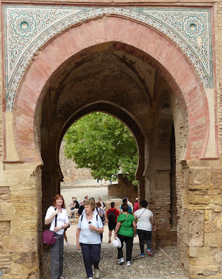
One of the oldest structures in the Alhambra complex is the Wine Gate. This ancient entry into what would have originally been the higher section of the Alhambra is visually dramatic with it's red brick arch & glazed decorative work.
Walking through the thickness of it's walls to the other side reveals one of those magnificent key symbols.
When we visited we wondered why it was called the wine gate when the Moors were Muslim & therefore didn't drink wine. We assumed that it referred to the wine colour of the brick, however, Mr Google has told me a different story!
According to legend it's name is due to a mistake (although no one seems to know who made the mistake!!). The gate was supposed to be called Bib al-hamra meaning RED gate, but one single letter changed that! It became known as Bib al-jamra which means WINE gate! I'm sure there must be a whole lot more to the story than that, but it wouldn't be the first time that a small mistake made a big change to the way something is perceived from then on.
Such an interesting structure & story captured my imagination today as I sought to create a response in my weekly art project.
As with last week, I sat at the computer today, zooming in to look closer at the photos we had taken & drawing the elements that most interested me. In the process I discovered that the glazed decorative work included more than one colour. As well as blue & turquoise there was a pale mustardy gold in places too.
In choosing how to proceed with design development I asked myself what were the important features that I wanted to express. They were the red arch, the blue & turquoise colours & the key.
With what I was going to try & produce, I needed three different outlines. This required careful pinning & concentration as each layer went under the machine one atop the other.
At last it was time to start cutting back. This is how it went...
Thus far, it was how I was expecting it to look, except perhaps for the middle section with the ikat motif. I initially chose it because the motif was very similar to one of those decorating the glazed panel. It certainly added intrigue, but I found it distracting. It was time to produce the key & see whether that would improve the overall composition.
I wanted the key to be loose, so that it moves, so used some very thick iron on interfacing to give it support.
Whilst I'm quite pleased with the key, the background is still not doing it for me. It was time to return to my original plan.
Cutting a small section of a paler turquoise & using my new fabric markers I drew in a repeat design .
The overall impact was more cohesive & with the key attached with a pearl the whole composition felt as if it was resolved.
Art making is often an ongoing process of question & answer, puzzle & solution. Sometimes there is no absolute answer & we just have to keep trying until it feels right. That was the case today & I'm glad I didn't just stop with the first option.


No comments:
Post a Comment