Monday, 20 January 2020

HORUS IN THE SACRAL TREE (WAP #2/2020; Inspired by travels in Egypt.)


From a tomb to a temple. This week's art project took me back to Edfu, where at dusk, we traveled by horse to the magnificent temple of Horus.

Walking past this large granite sculpture of the rather stern looking falcon god we entered what is considered to be the largest & best preserved Ptolemaic temple in Egypt.  Hard to believe it was buried under sand for nearly 2000 years!

Of the many photos I took of the incredible relief sculptures lining the temple walls, it is this that I chose as my source of inspiration for this week's project.  I don't recall reading or hearing what this panel represents, but from what we'd seen already in Egypt the imagery was not a common one.  What was this tree or bower? Was it some sort of Tree of Life?
With that question in mind, my day started with a scroll through Mr Google's fount of knowledge & from the little on offer, I'm making an assumption that this may have been the Sacral Tree. However, images of this tree seem to be shrouded in mystery.  This quote seems to sum it up;

"Portrayals and historical uses of these motifs remain an enigma to most historians and evoke little agreement with respect to their botanical identity and allegorical significance." (Atac 2008: Giovino 2007.)


Regardless of the extent of it's symbolism, I was attracted to the stylized lines of branches & leaves, so started to decipher how they worked together using pen & paper.
Because this was the temple of Horus, I felt it important to include him in some way, so flipped through my photos & made visual notes of the various falcon forms I saw.


How to take those few notes of imagery & try to create something fresh, interesting & achievable took a while to work out.  I drew thumb nail design options, not really happy with any of them.

As the clock ticked closer to lunchtime & my stomach began to growl, my executive-self declared that it was time to just choose one option & go with it!  So I chose the first option I'd drawn & worked & reworked it on an A4 sized sheet of paper until I was happy with my design. There was an audible sigh of relief when that point was reached!!


Whilst drawing up my design options I'd also been thinking about how I wanted my project to look.  What if I used ONLY layers of calico & cut some back to give the appearance of relief sculpture, whilst leaving other features just outlined in stitch?
This is the challenge that most excited me & so consequently choosing fabric options was the easiest  part of the process!  Eight pieces of calico were cut, ironed & layered up before my design was stitched through them all creating quite a solid wad!
With scissors at the ready it was time for the cutting back to begin...


I was very pleased with how effective this looked.
I wondered though, whether Horus might look better with a bit of colour added.
One of my intentions this year is to use my tools (ie; paints & print making equipment) & not be quite so precious about them. This was a good opportunity to put this intention into practice!


I chose Jo Sonya's acrylics because they wouldn't run & I felt sure I could also get a dry-brush effect with them.   The colours have dried stronger than I expected, but I'm still happy with the outcome.

The big question then was, do I add some colour to connect the Sacral Tree with Horus?

Throughout Egypt the painted reliefs are old & worn with many parts having no colour at all or tiny splinters of colour that hint at what it might have looked like in a by gone age.  With this in mind I got out my embroidery thread & did a little colour matching.


This is the end result.
I'm very happy with the outcome & particularly like the sculptural look of the tree branches. It was a new variation of using contemporary reverse applique & it honours the temple visit.

The piece feels wonderful to touch!  I realise that that is not often spoken about when talking about textile art.  There are so many times one must refrain from reaching the fingers out to stroke the cloth!  But with my own work, it's an added bonus to the experience of making.

Almost instantly I wanted to try this technique style again with a bigger art work.  However, on pinning this small piece to my pinboard & stepping back from it, I realised that it doesn't take many metres of distance for this to fade into next to nothingness! From across a gallery the colour might draw an audience closer, but not much else would.  Any larger piece would need a lot of consideration given to the coverage of dense cutting back & the percentage of paint.  All good for the ongoing learning curve.
Until next week...happy creating!

Monday, 13 January 2020

YELLOW OWL (Weekly Art Project #1/2020)

I'm back in the blogosphere! Yay!

Having not completed a weekly art project for several months, I recognised that I had a perfect opportunity to leave things as they were, accept the natural progression & not resume the practice at all.
However as I sat down to review my art making in the past year & look ahead to this year I realised that I missed doing this each week.  I missed starting my week with art making that was inspired by wonderful travels rich in memories, yet was purely about practice with the added challenge of writing about the process.

So here I am again.

Last year my weekly art projects were inspired by travels in Egypt.  Due to a death in the family I wasn't able to complete all that I wanted to, so have decided to resume with the Egypt explorations this year.

This first 2020 project takes us to a site up a dust track through farmland, past camels, buffalo & sugarcane into the cave tombs of Al-Kab. These tombs are unusual because they are on the EAST bank, usually tombs are on the west, because the sun sets in the west. The ancient Egyptians believed in eternal life. They believed that man was like the sun; weak when it arose (born), strongest in mid life & getting weaker again as it sinks into the west (heads towards death). The analogy continues, that as the sun rises again to a new day, so too does man. Al-Kab chose to put their tombs on the East bank because their location was very susceptible to flooding & they wanted to protect the tombs.   We were able to see four tombs of Noblemen and each was exquisitely decorated.

In one of those tombs was this wonderful yellow owl with red outlines.


Art making is, in part, about decision making. 
It was all very well for me to decide that I wanted to try reimagining this owl using textile processes, but what was I going to put with it? 
How was I going to frame it within a meaningful context...or even a decorative one?
And then how was I actually going to represent this owl using contemporary reverse applique?

When I'd entered this particular tomb, my mind had been overwhelmed with information.  Not only were my eyes trying to take in the motifs in hieroglyphs and relief paintings, I was recognising the images that hit my own personal 'Wow' factor & I was also trying to listen & inwardly digest the information the guide was giving us.  That is a lot to take in within a limited time frame & in low light!  I took quick photos of the parts of the tomb that made my heart sing, but didn't necessarily take photos of the bigger picture of how & where they fitted with everything else.

Therefore I had minimal data to inform me about this owl. Eventually I decided to keep it simple & just use the ^^^^^^ symbol on the bottom left of the photo.  It represents water, which is appropriate for a tomb trying to avoid flooding!!


One of the aspects I wanted to try & represent was the sense of age .  I was attracted to the deterioration of the plaster wall & wanted a textural background to represent that.
I chose to use a loosely woven curtain sample, which I then applied printing ink to in a random fashion.  The sponge roller gave a gentle coverage, which I really liked.


It needed stronger areas though, so I applied more with a brush.  This created the effect that I was looking for.  With temperatures heading towards 35 degrees celsius, I knew it wouldn't take long to dry!


I found fabrics for the other parts of the design, ironed them & then stitched the design through the lot!

I cheated a little!
I didn't have enough of the darker blue to cover the whole A4 area & no other blue would do. So, with careful placing & separate stitching I made use of the smaller pieces to frame the top & bottom. I was now ready to start cutting back.

It might be hard to believe...but I felt nervous!

The red was cut back to reveal this wonderful mottled goldy yellow.
I loved it just as it was.  Surely it wasn't necessary to keep cutting back? 
But I did!


I held my breath as I started cutting back to the background.  Would those solid colours be too strong against the textured background?
I was very pleased with the owl, but felt that the water  frames were just too strong & to be honest...they were boring.

It was time to get the embroidery threads & beads out!


This is the finished piece & I am very pleased with the results.
The embroidery definitely makes the water more interesting without detracting from the owl.
I'm delighted with most of the decisions I made about the owl. When studying the photo closely I'd spotted the pale blue hidden within it's features & am pleased with the way I've used it here to connect with the water.
A very pleasing start to the new year & a new week!

Monday, 3 June 2019

TOMB MONKEY. (Weekly Art Project #21; Inspired By Travels In Egypt)

Even though I love to be near water, I am, most definitely, not a boat person.  Cruises on massive oceanliners do not appeal to me in the slightest.

However, a gentle float down the Nile on a Dahibeya was an experience I was very willing to try!

Having loved the exciting escapades of Amelia Peabody in Elizabeth Peter's wonderful books, there was no way we were visiting Egypt without  time on the Nile in an Egyptian style sail boat. Lounging on the open-air deck, listening to an audio book of David Suchet reading Agatha Christie's 'Death on The Nile', whilst watching everyday life happen on the riverbanks, has to be one of the most memorable relaxing 'holiday' experiences of my life.

It wasn't all laid back laziness though.  One of the attractions of this particular tour was that each day we had an excursion with an expert to a site quite often not easily accessible by road & tour buses.      
The inspiration for this week's art project comes from the Tombs of Al-Kab.

After disembarking we followed a dust track through farmland, past camels, buffalo & sugarcane to to a series of cave tombs. These tombs are unusual because they are on the EAST bank of the Nile, usually tombs are on the west, because the sun sets in the west. The ancient Egyptians believed that man was like the sun; weak when it arose (born), strongest in mid life & getting weaker again as it sinks into the west(heads towards death). However, Al-Kab chose to put their tombs on the East bank because their location was very susceptible to flooding & they wanted to protect the tombs. They are, however, facing west.


We were able to visit four tombs & once again, I was overwhelmed with what a privilege it was, to see something so old yet so spectacular.

In one of the tombs the paint work was white, not coloured at all, creating a very graphic dimensional effect.
       

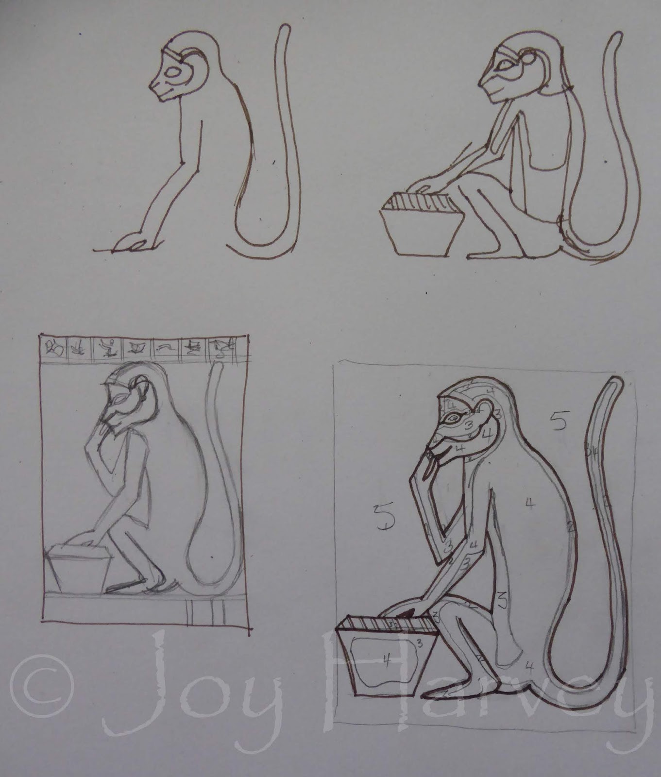
One of the images was of a monkey eating a date from a basket.  I've always had a soft spot for the Primates, (when my friends had their walls lined with horse posters, mine had chimpanzees!) This particular monkey brought to mind the first Indiana Jones movie when the poor little monkey ate a poisoned date!

How could I not have this little character as my muse?!


Using both of the photos above as my guidance, I put pen to paper to try & get my head around drawing a monkey!! (It's been a while!)

I was aware that my monkey would fit into a square shape more easily than a rectangular A4, so eventually I opted to create an square within the rectangle, which allowed for a border top & bottom.  This allowed me some leeway to create a bit more interest.


Fabrics chosen, cut, ironed, stacked & the design sewn through.  It was time to cut back!


So far, so good.  I was very happy with how this little fellow was coming along.  It was now time to think of tweeking to add interest. 

Using a brown fabric pen I drew in some partial hieroglyphs at the top. Partial because I didn't want them to detract from the monkey.  If they had been full, I think the eye may have been more drawn to working out what they were & what they might mean.  This way they are there & cropped to indicate they aren''t the important focus here!  Well...that's my reasoning anyway!!

I am so happy with him. He is a charming reminder of that wonderful visit.
Because I just couldn't help myself....


.... here is what a repeat image of the monkey looks like in my 'layout' app. I was disappointed the border didn't fit in, but I am still delighted with this outcome!


Monday, 27 May 2019

ANOTHER LOTUS PILLAR (WAP #20; Inspired by travels in Egypt)


After a short but refreshing break away, I returned to my workroom this week & got straight into my weekly art practise.  Once again I was drawn to the Temple of Khun in Esna & the lotus pillars, which were different in style from those I'd seen elsewhere.   What impressed me about this one, was that colour was still evident. I also liked the way the lotuses were placed in rows to create a border, as well as some height & interest alongside the feather-like leaves. I was also intrigued by the barely visible painted patterns between the lowest row of lotuses.

Over the past few WAP's I've been experimenting with using the top level of my 'sandwich' of fabric layers as background or outline for my contemporary reverse applique designs.  For this week's project I want to complete this sub-theme by using that first layer as both, within the one design.

For a change, I used felt tip markers to make my visual notes today.  It is quite interesting using colour immediately & seeing the way different colours, even in this quick & sketchy stage, interact with each other.  It was also a good exercise to practice using a colour other than black as an outline from the start.


The design had been developed, drawn up to A5 size, the fabrics were chosen, cut & ironed before layering up & stitching. It was time to now begin cutting back!


Over the past few weeks the colour in my WAP designs have been very flat, with little textural interest.  This has resulted in a more graphic style, which has been the intent.  This time however, I wanted to keep the colour flat, but introduce a bit more texture into my fabric choices.  Therefore, the 'white' layer was a heavy hessian weave curtain sample.

 Alas...the fabric swatch was not big enough to fit a complete piece under the other layers as I would have liked, so I had to cut pieces to the approximate size & carefully place under the top layer in the appropriate spot before securing them with the outline stitching.


The difficulty with placing small pieces of that thicker fabric so high up in the stack of layers, is that it showed & created a white line when I cut back to other layers.  Whilst this is ok for an experimental piece like this, for a more finished presentation it would have looked better as the lowest layer....which is where it would have been if it had been a bigger piece of fabric!!


It is hard to see in this photo, but the red fabric is covered in gold glitter, which attracts the light & sparkles!!


It is hard to see in this photo, but the mustard yellow fabric has a pattern of looser woven squares throughout it.


The finished piece, embellished with a little stitching & a few beads.  I'm quite pleased with it & think that using the topmost layer as outline, filler & background components within the same design has proven to be quite effective. Next week I'll move on from Esna & I think it's time to move on from such flat designs as well!Before I go though, here's what this design looked like when treated in my layout app!

Creating is such fun!

Tuesday, 14 May 2019

LOTUS PILLAR OF KHUN (WAP #19; Inspired by travels in Egypt)

It was time to move on from Luxor, although we would be back in a few weeks time when to spend a few days on the other side of the Nile exploring tombs in the Valley Of The Kings.  Now though, it was time to head off to Esna where we would board a Dahibeyeh for a 5 night float down the Nile!

There was just enough time for a quick look at the Temple of Khun though!

This Temple is dedicated to the creator god Khun & has an interesting history.  The original was built by Tuthmosis 3 (the Pharaoh who liked collecting plants whom I mentioned a few WAP's back) & was then rebuilt by Cleopatra's family. Obviously it was eventually drowned in sand, because it took two archeologists 13 years to dig it out!!

Perhaps it was the time buried that left the tops of some of the pillars quite dark...or were they painted that way??  Whatever the reason, the black made them different & therefore interesting.  I had seen quite a few lotus inspired pillar tops already during our adventures, but this one was different, so I chose it as my muse for this week's art project.


Pen & paper & concentration.....three very important tools!


Once I had worked out a design that was feasible within my A4 size restrictions & for using contemporary reverse applique, I got my fabrics together & gave them a good iron!
Each of my art pieces has a layer of calico on the base & one of the first things I do is rule up those A4 borders, purposefully extending each line.  This is so that when I build my layers up, I can line them up more accurately. 


Over the past few weeks of art projects, I have been specifically focussed on positive & negative space, especially in regards to creating outlines.  Most of my work involves the top layer being cut away from the stitching to become the outline.  Over the past few weeks I've worked on keeping the top layer as background & mass & cutting away to reveal the layers below which then make the outline.
This week, I wanted to do more of that, but I wanted to have two layers of 'background' colour.  This meant that one layer's lines were stitched in first before I put the top layer over it, pinned it securely & stitched in those lines.
I had to really concentrate whilst doing this....no distracting coffee, chocolate or Fb feed interruptions!!


This was how it looked as I reached for my scissors & began to cut back!!


You will notice that I only cut back one section of the pale grey angles in the background.  This is because I immediately recognised that having them in pale grey  was not a good choice.  For my sense of taste & balance, I would have been wiser to slip another piece of black fabric under there .
However, because I hadn't, I chose to get the same effect by....ahem...cheating a little bit! 


This is how it looked once I'd painted those angled chevrons black! 
So much better, it gives a sense of depth, by optically pushing the lighter grey stems forward.  I am very pleased with this outcome & have had reinforced yet again, how valueable samples are when exploring new techniques & design ideas.
I'm LOVING this series of weekly art projects, partly for the memories it brings back, but also for the opportunity to use some of these designs & patterns in my own way.  I do hope you are encouraged to venture forth on your own art adventures as well.

Monday, 6 May 2019

BORDER DESIGN (#18 Weekly Art Project; inspired by Egypt)


 After a few weeks break from my weekly art project, I was looking forward to returning to this discipline at the start of each week. 

When I walk into my workroom on a Monday morning, I'm never quite sure how the project will unfold & what the end result will be.  As this week's Monday approached though, my anticipation was tempered by the recognition that I was going to have restricted time due to other things in my life needing to be done! Therefore, I did a little pre-planning.

I chose this fragment of decoration on display in the Temple of Karnak, as my muse.  The engraved design has become quite worn over time, but it is visible enough to see that it is an interesting design to play with.


 Naturally I started with a simple drawing to get my head around what I was seeing.

Then, I jumped a few steps.  Instead of more drawing & playing, I immediately went to how can I do something fresh with this using contemporary reverse applique.  Into my head came the notion of Notan,  a Japanese design concept that uses a mirror image in light & dark within the same design motif. I have seen this effectively achieved in the felt work by local artist Maude Bath, but have never tried it myself.  I drew what I envisaged my motif would look like & saw the potential.


 I then took out my mobile phone, photographed the motif & put it through my layout app to get this repeat image.
This appealed to me very much & I couldn't wait to try it the very next day in my limited studio session.


 Monday arrived & so did another 'really-have-to-do-today' item for my list! Sometimes life just happens like that!  Knowing that the rest of my week was going to be just as full, I decided that when I DID get into my workroom, I would simplify the design even more & just make do with that.

Sadly, this meant that I wasn't true to the Notan concept, but was inspired by it!! Perhaps another time I will have an opportunity to give it a proper go.


 My weekly art project ended up being a mirror image of the motif in chocolate & blue.  I used a variegated blue thread to sew  the outlines in the chocolate fabric & a variegated chocolate thread to sew the outlines in the blue fabric. Although not very noticeable, it still added to the interest!!


 Having had an exciting outcome using the layout app with my initial drawing, I photographed my project piece to see what this would look like as a repeat pattern as well.  This is the result.


 Before pinning my WAP to the pin board, I thought I'd add a little embellishment...buttons, to make it less flat looking & give it a little personality!


To finish off, I tried the app treatment again & this is the result.
Much as I am disappointed not to have realised my initial plan for this week's project, I am pleased with what I got done in a limited time. I also love the potential of using a limited palette of light & dark within a repeat pattern design.  A good way to get back into the routine of experimenting with contemporary reverse applique!